Green Culinary Restaurant Visual Identity Logo
Dutch Designer creates visual identity for Eeterij 't Lambertje
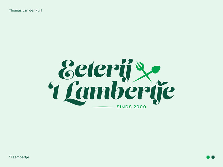
Dear friends. As the creative mind behind the snazzy new logo for Eeterij 't Lambertje, I'm excited to share the design story that blends the restaurant's cherished legacy with its progressive vision. The goal was to strike the perfect balance between honoring the past and embracing the future, and I'm delighted with the outcome.
The modern logo is dressed in stylish colors that resonate with the lively spirit of Eeterij 't Lambertje. Keeping a trace of the original green and yellow palette was vital, as these colors are deeply woven into the restaurant's identity. I've artfully infused green into the design, offering a subtle wink to the past while stepping boldly into the present.
Eeterij 't Lambertje is a culinary haven, where guests can treat themselves to sumptuous three-course meals, grab-and-go delights, and comfort food favorites like milkshakes, ice cream, and fries. The menu also boasts delicious dishes like nasi, bami, and various meats. This diverse offering inspired the logo's versatility, as it adapts effortlessly to the restaurant's ever-evolving tastes.
So, there you have it – a chic, modern logo that embraces Eeterij 't Lambertje's rich history while capturing its contemporary charm. It's been a thrilling design adventure, and I can't wait to see this logo become an integral part of the restaurant's story!
Take your brand to new heights with Dutch Design!
Don't hesitate to get in touch with me via E-mail:
🚀 info@thomasvanderkuijl.com
💼 Let's link up on LinkedIn and take our professional networks to the next level!
📷 Join the Insta-party and catch my latest projects today!
