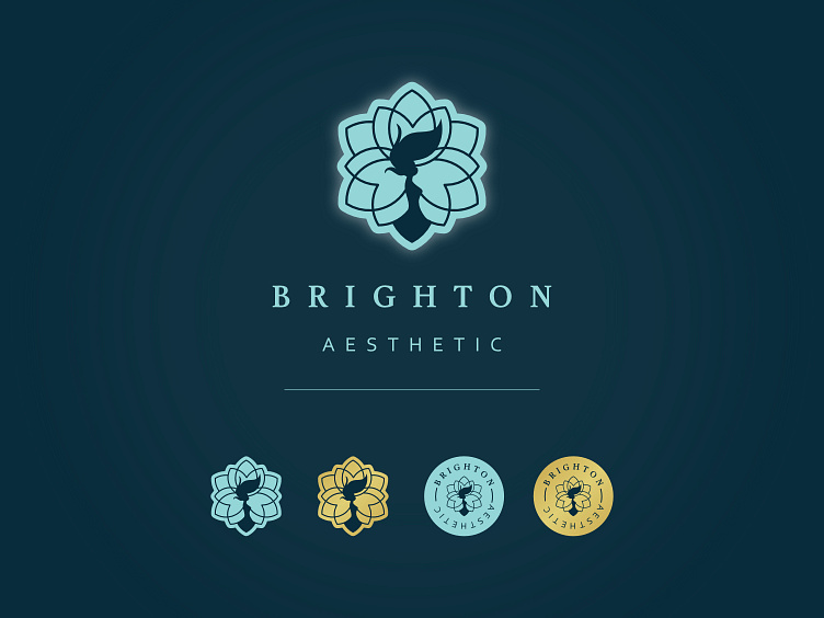
Brighton Aesthetic Rebrand
Brighton Aesthetic is an aesthetic clinic that offers non-plastic surgery cosmetic procedures. Additionally, the clinic provides aesthetic training for individuals who aspire to pursue a career as an aesthetic practitioner. As a designer, I was commissioned to give the brand a modern and refreshed look, while also incorporating the colour gold as per the client's request. To achieve this, I created five different variations of the logo that could be used across various designs. Furthermore, I designed a colour palette that features various shades of blue and cream, which effectively communicate the brand's natural and refreshed feel. Overall, my redesign of Brighton Aesthetics branding successfully achieves a modern and refreshed look that captures the essence of the brand's identity. The new logo and colour palette offer a cohesive design that will surely resonate with the clinic's clients and students alike.
Brochure
I utilised the design principles that I employed in the billboard design to create a brochure that would effectively showcase all of the client's services.
Social Templates
I created two variations of the same design for a social media post. The purpose of this design is to communicate a 50% discount on the client's next visit to the clinic.
Billboard
This is the mock up that I presented to the client. My inspiration for this design was the Campbell's canned food packaging, which features a two-toned design separated by a gold element. I found that this design choice aligned well with the client's request to incorporate gold into the colour palette. Overall, the mock up effectively communicates the desired look and feel for the product's packaging. The two-toned design with the gold element offers a visually appealing and cohesive design that is sure to catch the eye of consumers.


