Super Secret Project
Intro
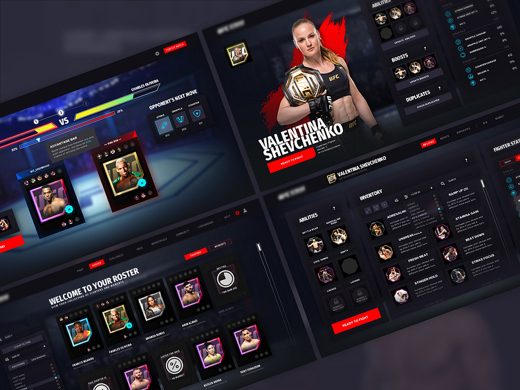
Select screens of in progress work I've done for an unreleased title. Plenty of placeholders, changes/updates expected. Lead UI/UX Designer running the project.
Roster Screen
Here you're able to view & sort through your collected fighters. The rarity of the fighter is indicated by their background/frame color. Fighters also display whether any abilities (max of 6, top) or boosts (max of 3, bottom) are currently equipped.
Manage Fighter/Overview Screen
Players are able to manage their collected fighters here. This page is essentially a hub, giving you quick access to equip abilities, boosts, stack duplicate fighters (fuse them together to further strengthen them), view overall fighter stats and info, etc.
Abilities Screen
Players are able to equip abilities and boosts onto their fighters, selected from those available within their inventories. When equipped, fighter stats are modified and displayed on the right side of the screen.
Abilities Screen Variant
Other layouts/explorations
Duplicates Screen
Players can merge/stack duplicate fighters together, increasing their stats and overall abilities.
Combat Screen
Combat screen displaying your selected fighter, and your opponent. The game incorporates a rock, paper, scissors mechanic (Strike, Grapple, & Counter fighting styles) and you as the manager/coach are to instruct your fighter on what to do. Your choice, alongside their overall stats and any "boosters" equipped (1 time use items during a fight) determine the likelihood of you winning a round.
Wireframes
Select early iterations and concepts.
Early UI Animation/Transition Prototype
Before entering a fight, players are given the option from selecting 3 set modes (Sparring, Daily Battle, or Weekly Tournament).
Selecting a mode brings the user to their Roster Page (essentially a character select screen) of all their available fighters they've collected.
Players can then choose to either manage their fighter, or (if ready) start a fight (Sparring Mode is random, for training purposes).
~Rendered in After Effects
Alternate UI animation
Early Combat Prototype
Video mock rendered in After Effects, with an aim to communicate how the game ui might transition in/out, when the audio might play (crowd default, crowd fight, fighter sounds), how combat might look (low fidelity), etc.
Playtest Feedback Sample
Summary of potential points of friction & suggested solutions
*Players were given tasks to accomplish (below), and observed during their live gaming session
Select Sparring Mode
Select their favorite fighter
Equip/prime their fighters for an upcoming match
Win a sparring match
Fighter NFT Concepts
Keeping consistency with how UFC Strike's collectable NFT moments look like, I was responsible for creating potential Fighter NFT concepts that players would collect. Things considered important to display were the Fighter Image, Name, Nickname, Win, Loss, Draw #'s, Weight-class, Country, Quote, Series number & Snapshot identifier, as well as the UFC logo & legal, etc. This was all encased inside a container/ring, color coded depending on rarity.


