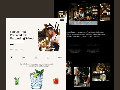
Bartender School Website Design
Sip some elegance and style with our new web design project. Here's another glance at the website for the bartending school and courses for those who strive for knowledge and practice in the sphere. Elegant layout playing with typographic hierarchy, contrast and negative space and well-arranged theme photo and video content together make the page not only informative but also eye-pleasing and emotional. Stay tuned to see more!
If you want to collaborate, contact us via hire@tubikstudio.com
Also, welcome to check:
• the massive and growing collection of tubik design case studies
• the big set of functional and awe-inspiring web design concepts
• the diverse collection of practical design articles in tubik blog
More by tubik View profile
Like
