La Bella Medical Aesthetics - Web Design
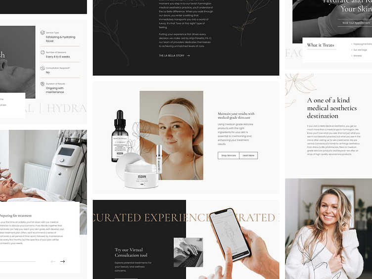
La Bella Medical Aesthetics approached Lifted Logic with a fun website refresh project that utilized a unique combination of photography, decorate elements, and educational content.
While the goal was to stick with a minimalist, classic-neutral color palette to ooze sophistication and class, La Bella definitely did not want a basic or boring site.
We designed this particular medical spa's website to integrate more playful elements to help provide balance to the neutral colors, including:
Tons of bold full-screen moments
An interplay between light, bright, airy photography + a strong black-and-white style
A confident balance of strong colors & sharp lines + loose, organic, feminine icons & floral imagery
A contrast of layered cutouts & maximal sections + large simplistic breaks
Made with 💜 in Kansas City
Website / Get a Quote / Instagram / Clutch
