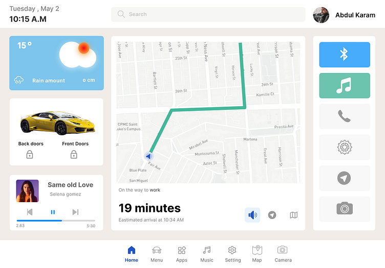
Car Interface #DailyUI #034
Hi designers!
The design of a car dashboard should be intuitive and user-friendly, allowing the driver to quickly and easily access important information and controls while driving. Here are some key design principles to consider:
Clarity: The dashboard should be easy to read and understand, with clear and concise information. The use of large, easy-to-read fonts and graphics can help ensure that the driver can quickly identify important information.
Simplicity: A cluttered dashboard can be confusing and distracting for drivers. It's important to keep the design simple and easy to navigate, with only the most essential information and controls displayed.
Ergonomics: Controls should be positioned in a way that is easy for the driver to reach and operate without taking their eyes off the road.
Aesthetics: The dashboard should be visually appealing and consistent with the overall design of the car.
Customization: Some drivers prefer to have certain information displayed more prominently than others, so it's important to allow for customization of the dashboard display. For example, the driver may want to have their phone connected to the dashboard display for navigation or music playback.
Overall, the design of a car dashboard should prioritize functionality, ease of use, and aesthetics to create an enjoyable and safe driving experience for the driver.
Please provide your feedback and I hope you like it. Cheers!
Thanks for your likes and comments.
Want to create something great?
Feel free to contact: designer.ux.san@gmail.com

