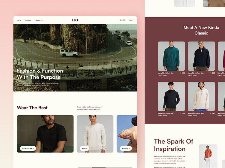
Fashion E-Commerce Platform, Web Design, Landing & Product Page
Hii Dribbblers!👋🏻
We have created a minimalist design for a fashion e-commerce platform.
The first screen is the landing page where we wanted to reflect the brand's identity while giving it a neat look.
For the second screen, we wanted users to be clear about the product they were looking for.
Hence, we allotted the left part of the screen specifically for the product's image and the right part for product specifications.
Our focus was to optimize the user experience by reducing unnecessary elements and letting users focus on the product section of the screen.
What are your thoughts on this design?
Let us know in the comments below.
We are available for new projects!
We are experts in:
Feel free to reach out to us at: business@octet.design
For more - Look at us on Octet Design Studio
Follow us on: LinkedIn | Behance | Instagram | Twitter | Medium

