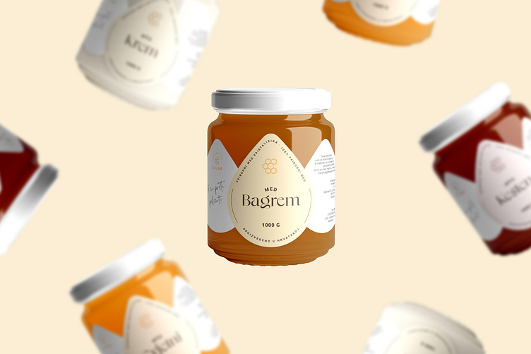
Branding and Packaging for Cilar Beekeeping
Beekeeping Cilar is a small honey family company based in Croatia, Međimurje. They are looking to update their branding and create a new visual identity that reflects their commitment to quality, sustainability, and a modern aesthetic. Their focus is on producing high-quality honey using sustainable practices, so they want their new branding to reflect this. Beekeeping Cilar was founded in 1994. Their honey is sourced from local hives, and he never uses harmful pesticides or chemicals in his production process.
I worked closely with the Cilar family to understand their values, target audience, and competition. I conducted extensive research into the honey industry, looking both local and national brands, and came to the conclusion that a modern approach would be the best solution so I designed and created a visual identity that reflects what they stand for.
The result was a logo that combines a beehive and flowers, two iconic symbols of the honey industry, forming the letter C, the first initial of the name Cilar. The logo is clean, modern, and eye-catching. With outlines and a simple color palette that reflects the company's commitment to sustainability. The overall effect is a brand that is both approachable and sophisticated.
For the font, a sans serif was chosen, which was completed with a detail in the letter A where a small drop of honey was inserted. The handwritten font of their name was also added to the design, which when looked at closely looks like a bee, what again gives the brand a personal touch.


