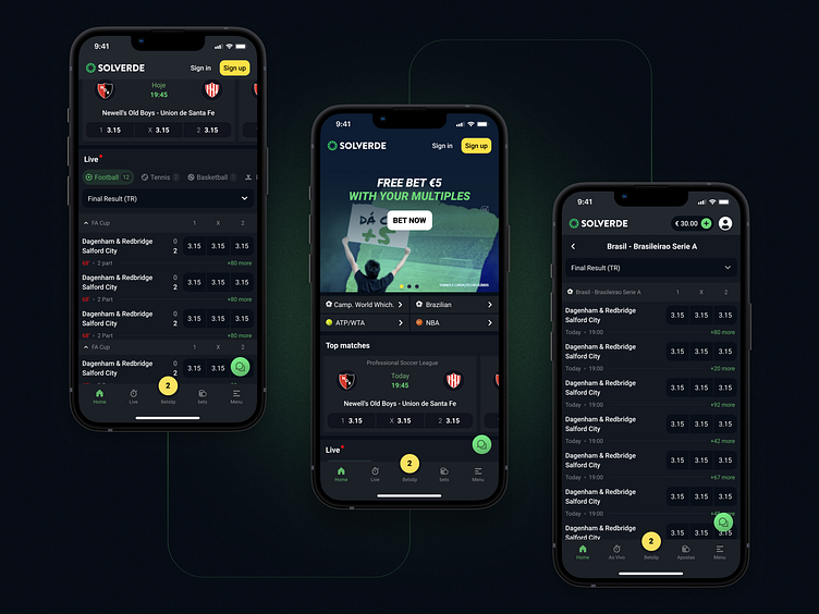
Solverde: Match center
The sportsbook's main page consists of leagues, matches, markets... There's a lot of information and it's very easy to get lost if it's poorly organised.
Even though we couldn't change the structure of the page, with a wise use of colours and accents, we've managed to highlight all the elements in a way they are easy to perceive
Behance: https://flatstudio.co/projects/solverde
Website: https://www.behance.net/gallery/160033597/Solverde
┈┈┈┈┈
Looking for a design company? We would love to hear about your needs. Contact us: http://flatstudio.co/contact
┈┈┈┈┈
Flatstudio · Instagram · Facebook · Twitter
P.S. Follow us & Like [L] this shot to share the love! 😍
More by Flatstudio View profile
Like
