#DailyUI 005
App Icon
Design Hint... Design an app icon. What best represents the brand or product? Or is it incredibly unique? Does it look great at a distance and does it stand out when put on your home screen alongside other apps?
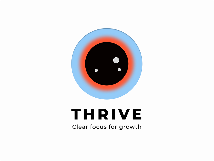
The central element of the logo is a circular shape that suggests movement and progress. The eye resemblance is used to represent clear vision and focus.
The slogan emphasizes the idea of focus and clarity leading to growth.
The combination of blue and orange contrasts well and creates a dynamic feel.
I chose the topic of the growth because it is such an important topic for me as a designer - to learn, get insights and inspiration to grow. #DailyUI
What do you think?
