Dask Typography

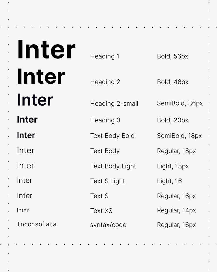
Typography does silent heavy lifting in any well thought out brand. It sets the tone and conveys meaning at a glance.
For Dask we chose a clear, highly readable sans serif font to work across digital platforms.
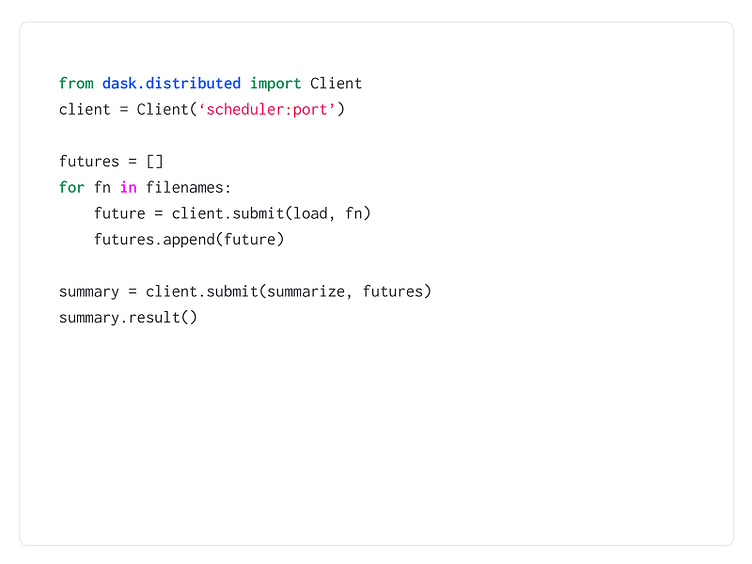
We also brought the brand into the UX by developing custom syntax highlighting based on their new color palette.
Read the full story in our Dask case study: https://www.ashandelle.com/case-studies/dask