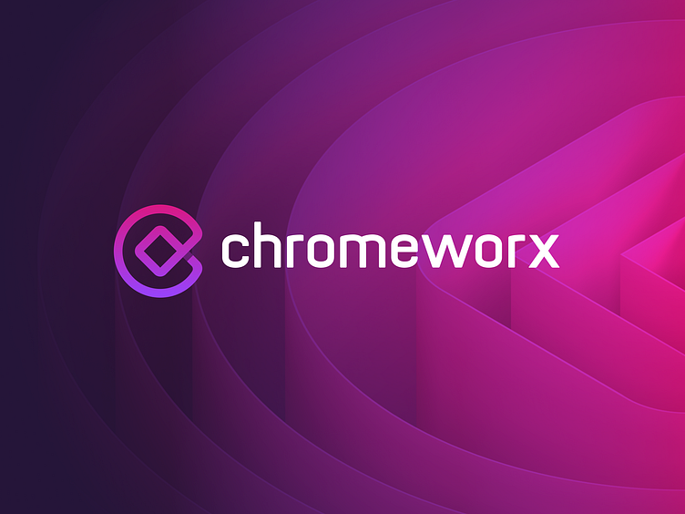
Chromeworx - Branding Case Study
Chromeworx was a Google Solutions technology consultancy which was soon acquired. They initially reached out to our team to help them with their branding and website design.
Inspiration & Mindmapping
Before we began the core design phase, it was crucial for us to establish the Chromeworx brand strategy. This entailed identifying their target audience, business objectives, and competitors.
To generate ideas for the logo and visual language, we created a mindmap of relevant keywords. These keywords were the building blocks for the visual language of the brand and formed the basis of the logo design.
We arrived at a concept for the logo that captured the essence of the Chromeworx brand. The logo combined the letter "C" for Chromeworx, a box to represent their "Out of the Box" solutions, and the infinity symbol to represent their seamless customer service and delivery.
Logo Construction
Once we established the creative direction and completed some initial sketches, we created the final pixel perfect logo. We were concious to ensure that the logo would be suitable at both small and large scales, and compatible with any brand asset Chromeworx required, thus better future-proofing their brand.
Print Media & Mockups
The finalised logo became a great basis for the visual language, providing us with many creative pathways to explore for their brand assets.
From this we designed a set of key visuals, mock layouts, print and digital media assets which all aligned with the versatile Chromeworx visual language and identity.
Landing Page & Website
We also developed a new website for Chromeworx which further explored their new visual language.
Feel free to leave feedback as well. We're always keen to hear what you think. Thanks for checking us out 💖
____
Contact me for all your brand identity, scalable website, web or mobile app design needs:


