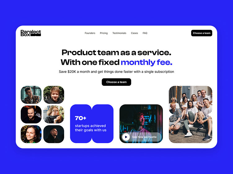
Paralect Box landing page
About Paralect Box
We announce a new offer from Paralect: a full product team for one monthly subscription. Engineers, designers, product managers, and QA engineers — all in one place.
No matter where you're at — Pre-seed, Seed, or Series A — you can enable rapid expansion, keep your burn rate low, and hit your next milestone faster.
Our design solution
We wanted to focus on advantages for founders and be clear about our new offer.
Firstly, we aim to clearly communicate benefits that our new offer can provide to founders.
Then, we take the time to compare our services against similar options in the market. By doing this, we can confidently demonstrate the unique value that we offer and why we are the best choice for the client's needs.
To further enhance our clients' understanding of our services, we have created a calculator that helps founders to estimate the monthly costs associated with working with us.
Furthermore, we understand the importance of social proof in the decision-making process. As such, we provide a portfolio of companies we have worked with in the past, as well as feedback from real people who have experienced our services first-hand.
The website was not only created in white UI, but we also implemented a dark theme.
Serhei helped me to create 3D for cards.
Calculate your personalized subscription and try our 7-day $100 trial on box.paralect.com
Thanks for your valuable time! L for 💜


