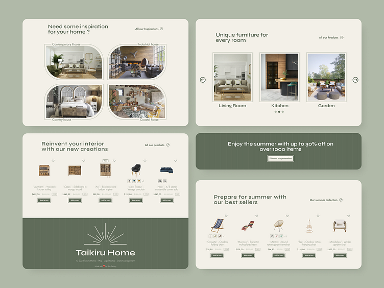
Home page for a furniture e-commerce website - Japandi Style
Hello Everyone !
If you like what you see, don't forget to press the ❤️ icon and to follow me.
Here is the full page of a previous project with the Japandi Style. It's the combination of Scandinavian design and Japanese minimalism to create a feeling of nature and simplicity. And I'm in love with this style.
Hero Section
Here is the hero section of this landing page. The first screen you see when you arrive on this website. I wanted it to be as clear as possible. The main goal is to catch the visitor and for him to understand the vibes of this furniture brand.
Full Page
Here is the full home page version :
Do you think the objective has been achieved ? Let me know in the comments. And if you have any suggestions on how to improve the design, don't hesitate to share them as well.
We will post update on this landing page soon
You have a project ? Contact us at - contact@blitz-agency.fr
And together we will make some great things !


