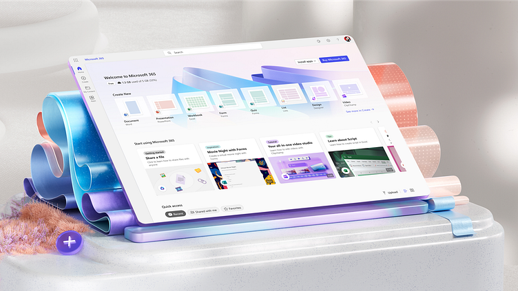
Microsoft 365 imagery
See more: https://msft.it/6005gR0P5
The recent redesign of the new Microsoft 365 icon provided an opportunity for our design teams to update the imagery 🖼️ we use in and outside of the app experience with Not Real. These images are the latest update to our Microsoft 365 imagery from our design teams–exploring the concept of a ribbon as a method to seamlessly highlight the app’s main colors while also representing their connectedness 🪢.
Along with those concepts we’ve also updated the color palette 🎨 in our imagery to be more reflective of our M365 app collection’s individual colors. You can see these images in the Microsoft 365 app today and coming soon to the app store.
We would love to know what you think, all thoughts are welcome 🫶.
More by Microsoft Design View profile
Like
