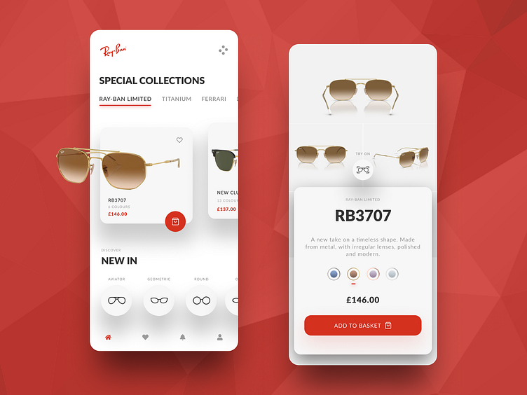
Ray Ban - Try On
Exploring In app e-commerce with digital try ons for Ray Ban.
Building on the aspect of reductive and less is more.
The user has the capability to browse the app and the products as normal.
One product listing page, the user also has the ability to try on the glasses as filters. This does require higher in app level permissions such as camera.
One thing that requires a change is definitely the use of red in its context and is isn't quite accessible, Ive followed the core brand colours and use of their brand guidelines. however id go as far as saying that the red used here within certain elements does not meet AA.
I would instead change the button copy and iconography to the shade of black used in the H1 & H3's and instead of solid colour on the button do a border colour of grey or red to keep in brand but also make it accessible.
