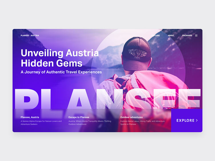
A travel agency's experimental colourful hero section
For this design exercise, I created a hero section for a travel agency with simplicity and typography at the forefront of my mind. I aimed to create a visually captivating design that immediately draws in the viewer and conveys a sense of adventure and wanderlust.
To achieve this, I played around with different typography styles, experimenting with different fonts, sizes, and weights to create a hierarchy of information that would guide the viewer's eye through the section. I wanted to ensure that the text was easy to read and conveyed a clear message about the travel agency's unique offerings and value proposition.
Overall, this was a rewarding design exercise that allowed me to push my creative boundaries and explore new techniques and styles. I hope that my hero section design for the travel agency will inspire others to think outside the box and create designs that are both functional and beautiful.

