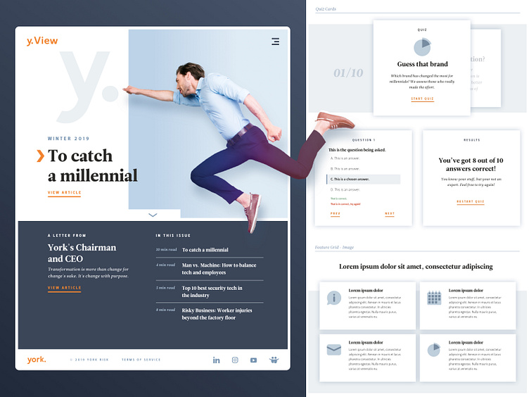
Quarterly Magazine Website Design
I was the lead designer on an internal marketing team tasked with creating a quarterly eMagazine website design. We wanted the experience to read like an actual magazine, with an impactful hero graphic and title.
We developed the sitemap and created cover graphics for several quarters. Each cover graphic set the tone for the articles within. We wanted more interactivity than an average blog article experience, so we developed a robust library of plug-and-play modules. Users could interact with quiz or tab through content within the article to learn more about a topic.
More by Eric Kemp View profile
Services by Eric Kemp
Like


