Redesign - Bigelow
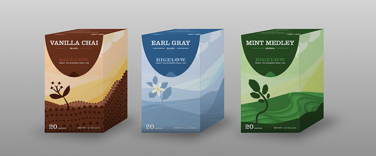
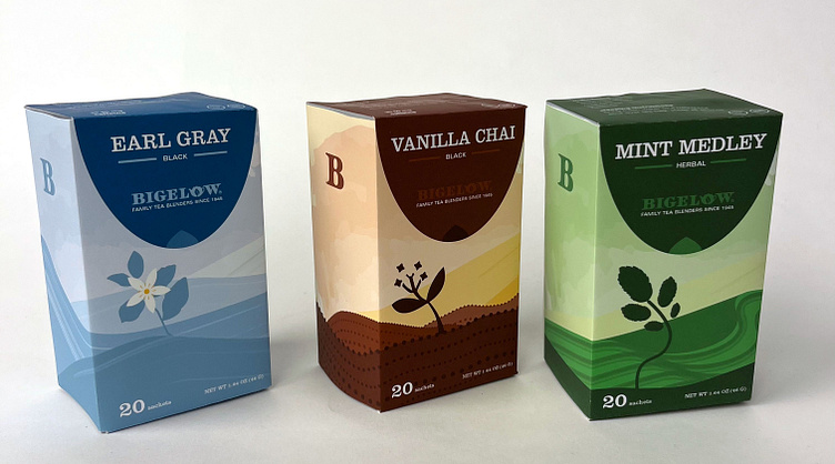
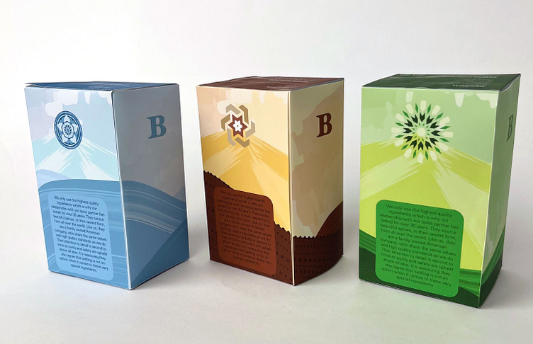
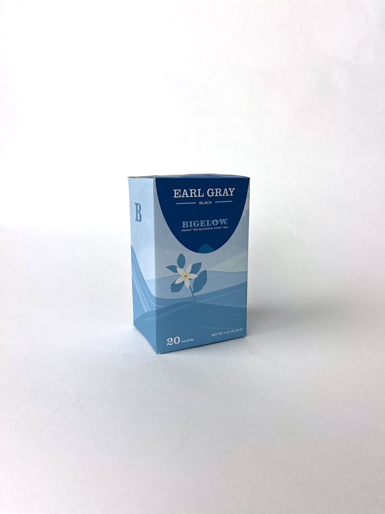
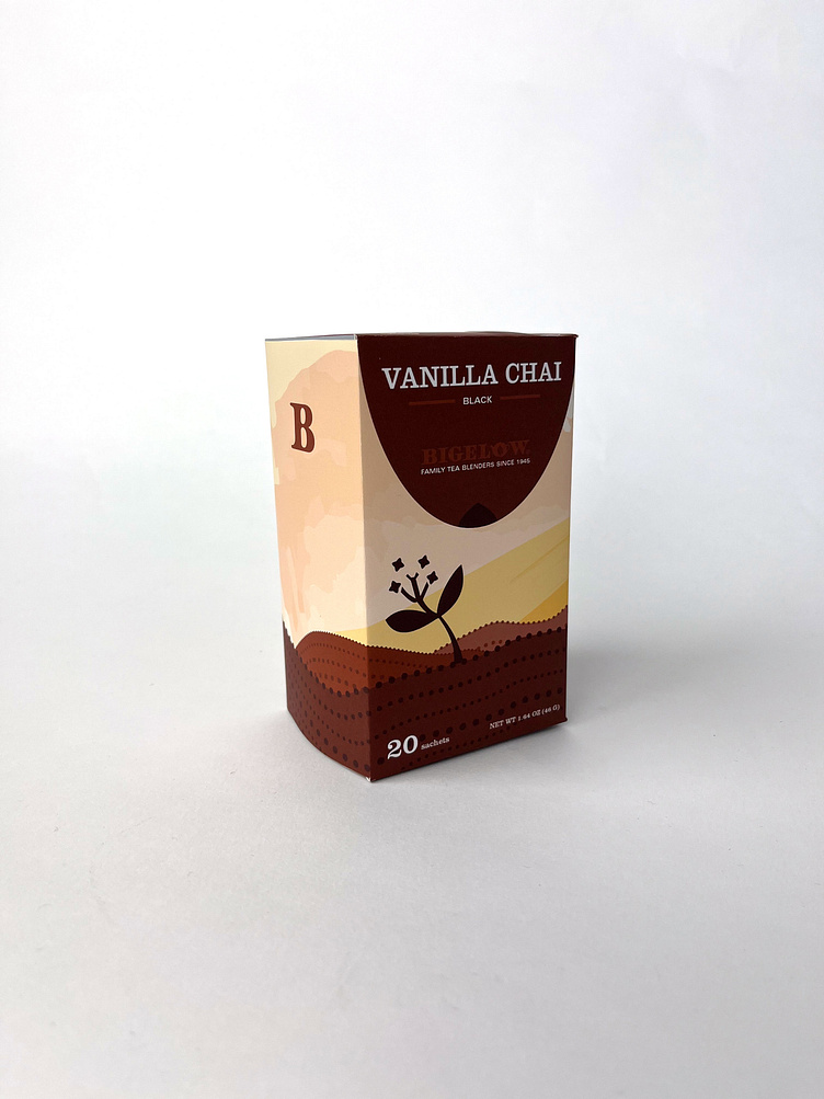
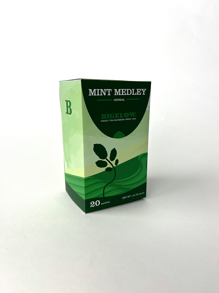
A mock redesign of the tea brand Bigelow. Their current design has lots of information on the box and I wanted to display it more effectively to reach a wider audience. I think having interesting packaging helps draw consumers towards your product. I studied landscapes from each country that the tea flavor originated from and created a scene using watercolor like brush strokes. I wanted the packaging to be unique, illustrated, but not too busy. The symbols on the back are meant to be representative of the respective countries the tea originated in. Each are based on designs in ceramic, architecture, or traditional artwork.