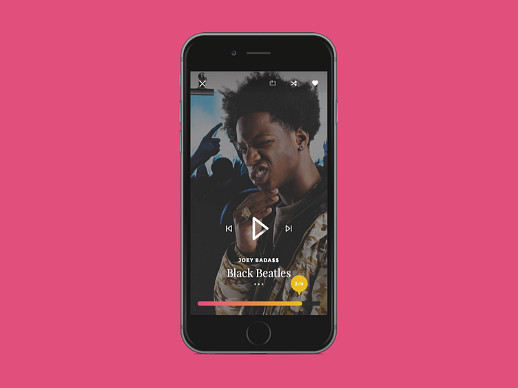
Now Playing - Music App (Mobile)
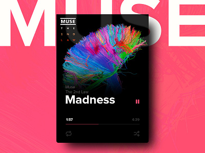
Here's a quick mockup I did of how the mobile "Now Playing" screen might look like on mobile. Heavy focus on the artist imagery, primary actions located near the bottom half of the screen and less used actions at the top. You can also swipe left/right to go to the prev/next song. Check out the Desktop version and the Smartwatch version.
Also I'm thinking of doing a 30 day personal challenge (inspired by @Paul Flavius Nechita), where I would post a shot everyday for 30 days. I'm not really good at these things but I want to try to set a goal for myself.
More by Amit Jakhu View profile
Like

