Durty Gurl Feedback
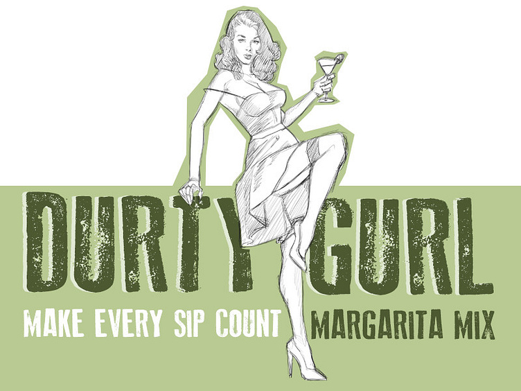
Hey everyone, I have not been on for a bit, but I was hoping for some feedback on this. I am mainly working on the illustration at this point but it will be used as the basis for the branding and the labels. I based the idea on the old school pulp novels and pinups so I want to give it a bit more edge considering the name. the large color usage should be an effective solution for the shelves and variety of flavors offered. If anyone has any comments or suggestions on a better distressed font or pulpy font that would be greatly appreciated. Maybe a companion font for the lower line as well. Hope the direction is the right one so far. Thanks again!