Swif — Landing Page for Multitasking Messenger
Hello, Dribbble world! 👋
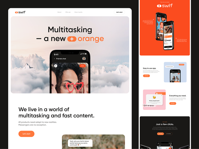
Today we continue our complex project for a multitasking messenger application called Swif. Previously we showed you our branding and today we presenting you a crucial part of any marketing strategy - a landing page that promotes this digital product.
Our design solution
The landing page is made in the form of a story.
At first, we talk about the problem that the user faces, namely, there is always little time for everything, and everyone strives for multitasking.
Then we smoothly move on to the solution to this problem - the Swif app. We talk about its advantages and show an attractive and user-friendly interface.
We reinforce the benefits with authentic user reviews and encourage the final action (Call to action) - downloading the app.
Such a logical landing page structure will help increase website conversion and turn the viewer into an app user.
Main accent
The main feature is that the messenger includes many functions, and the main one is to split a check (after going to a bar with friends, for example) right during a video call/chat.
Pretty convenient thing!


