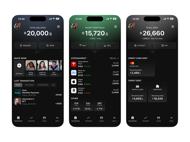
Fintech Bank App
Hi folks! 🙋🏻
In this case study, I designed the main page of the banking application in three structures. Total Balance, Investment Portfolio and Total Debt.
On the "Invest Portfolio" and "Total Debt" pages, there is Daily, Weekly and Monthly status information below the balance and debt information.
Let's watch it out in the video below. ⬇️
Send Money 💵
On this screens, we see the money sending process. When write the balance want to send, the "backspace" button appears next to the balance for edit balance.
Watch the animation and button effects from the video below. ⬇️
Cards
In the Cards tab, can see debit and credit card, create a new card or select major card operation from these screens.
Watch the cards transition from the video below. ⬇️
Quick Menu
This screen is designed to use the main features of the app. It can be accessed via the menu button on the top right of the main page.
Let's watch the video below to see how the menu layout changes and how to delete the menu. ⬇️
All Pages ⬇️
Thanks for watching! 🫶🏻
Twitter @ogzhndemirkol


