Glaze by Rudina - Brand Identity Case Studie
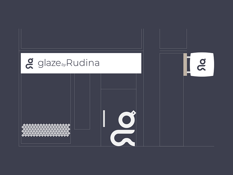
Today, I'm excited to share with you my recent logo design project for Glaze by Rudina, a makeup and hair salon studio. My challenge for this project was to create a logo that conveyed the idea of glaze - the special touch that the salon adds to every client's look.
To start, I researched the salon's brand values and target audience. I learned that Glaze by Rudina values quality, luxury, and attention to detail in their beauty services. Their clients are primarily women who seek a personalized and indulgent beauty experience.
With this information in mind, I started brainstorming logo ideas that could capture the essence of the brand. I wanted the logo to be elegant, feminine, and modern, with a touch of glamour. I also knew that I needed to incorporate the idea of glaze, which is the salon's unique selling point.
After several iterations, I landed on a design that combines the initials "G" and "R" in a flowing, cursive script. The letters intertwine to create the silhouette of a woman sitting in a salon chair. To complement the logo, I selected a Sans Serif font that evokes elegance and femininity. I also chose a color scheme of deep purple and dusty gold, which conveys luxury and sophistication.
In conclusion, designing a logo for Glaze by Rudina was a challenging and rewarding project.
Through research, creativity, and collaboration, I was able to create a beautiful and effective symbol that conveys the salon's unique selling point and brand values. Thank you for your attention, and I welcome any questions you may have.
Contact me to get your logo design or branding project done: me3mts@gmail.com


