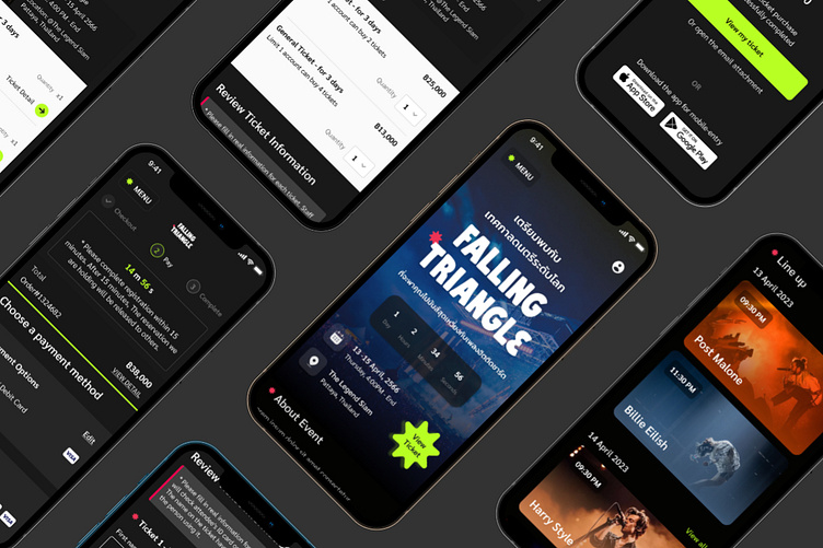
Event ticketing system Case Study - Responsive web mobile 🎵
The method I used to characterize the Web:
It’s important for me to mention that I did all the process of characterization and design using Design Sprint. Thanks to this method it took me a total of 3 days to characterize and design the Web.
Our Representative Persona
Referencing the data, I created a User Persona to define the type of person I would be designing the micro-site for Tuus Jereena, the 24-year-old, fun-loving enthusiast, was born.
Creating the Brand
Feeling confident in my refined flow, I began working on the Festival branding and website UI. To do so, I defined brand attributes, created mood boards around those attributes, and then created a style tile to begin converting the emotions present in the mood board into design elements.
Brand Attributes & Moodboard
I used a dark color for the app’s background with the purpose of demonstrating “Nightlife”. my brand attributes as:
Fun
Energetic
Exciting
the feeling of music festivals is described as “colorful”, “energetic”, “electric”, and “fun”. This ticked off every brand attribute and added some extras, so I continued on this same path.
Style Tile
The moodboard lead me straight into my style tile (a visual reference to the design language of a website). Remaining consistent with the imagery of the moodboard, I defined our logo, color palette, and the typefaces, as well as some UI elements, like buttons and icons.
Responsive Web (Platform)
The chance that users will load the web for regular use is still considered very small. with device limitations
I choose to use Platfrom Responsive web because...
Convenience and hassle Including helping to reduce the cost of maintaining the website. because there is only one website No need to edit multiple web pages and no server waste.
Make your website mobile-friendly. also known as "Mobile-Friendly", which nowadays, the number of users of websites from mobile phones is increasing.
Users can use the website easily. also known as “User-Friendly” regardless of the device or screen size when browsing the site.Support for SEO (Search Engine Optimization) with Google both desktop and mobile versions on one website.
User Flow
After exploratory and market research, I had gotten a fair understanding of the primary user flows for Web. User flow allowed me to see the complete app experience at a holistic level. Furthermore,this flowchart helped me make a checklist of all the pages to be designed (represented by Blue).


