Research website of Technical University of Chemnitz

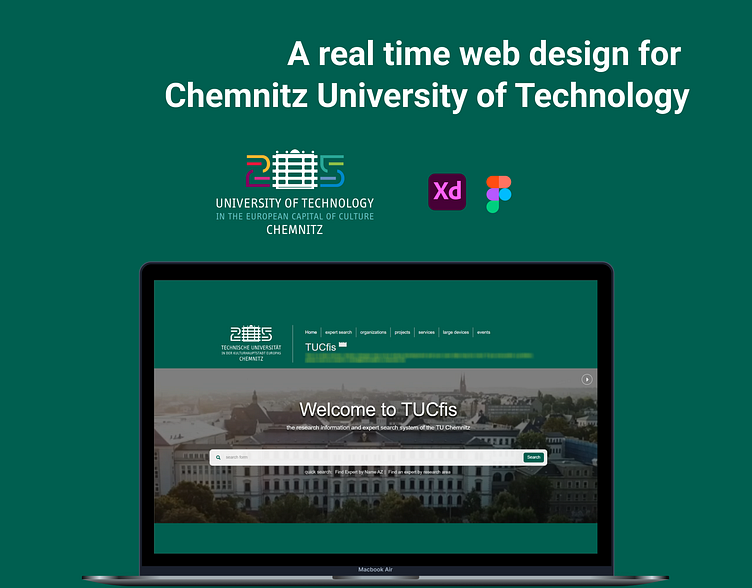
Research website design for TU Chemnitz (Germany)
Project Overview
Technical University of Chemnitz (TUC) has started this project (TUCfis – FIS:Forschung Informationssystem) to establish a new Research Information system providing structured academic information in a Linked Data fashion.
At Technical University of Chemnitz (TU Chemnitz), a new project was underway called as TUCfis (ForschungsInformationssystem) - aimed to revolutionize the way academic and research information were presented and accessed.
The target audience for the new system? → Esteemed professors and research assistants of TUC themselves.
And that’s where my tasks came in with improving features and correcting errors in the alpha stage design of the website. 💪🏽
I joined the team after the initial deployment of the website, which was already being used by over 3000 users. No small feat, to say the least. But with determination, I sat to work.
The research information and expert search system boasted a variety of options for searching projects, people, research areas, lab devices, events, and more.
But the biggest challenge for me was ensuring that the design revisions were implemented smoothly and that the contents were delivered accurately across various landing pages.
And in the end, the new TUCfis system was a resounding success, thanks to the hard work (appreciating ourselves after a working hard is important). 👏🏽
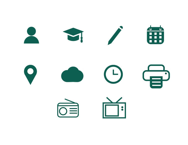
Icons design
(Scroll below below to see the icons)
One of the professors gave me an introduction about what, why and when the project was started, how it was going. Since there was already alpha version of the website was live, I had to start with gathering information about the problems in that. It included what was working well, what had to be improved, what is to be included as a new information.
After I got some idea about the website, I was assigned to design icons because developers were waiting to deploy some pages. I have designed icons many icons including User, Research project, Events, Organization, Location, etc. For designing icons, I had to look into the website to know about colour, animation, size, style.
I have designed the icons using Adobe Illustrator and it took some revisions for the final approval.
Some of the icons that I designed during the entire project are below.
Design?
Professional, Simple, Neat
My professor/supervisor's requirements for my project were clear: design the website for university professors that looked simple and neat.
So, I focused on creating a sleek, minimalistic design that was highly intuitive.
Secondary research output
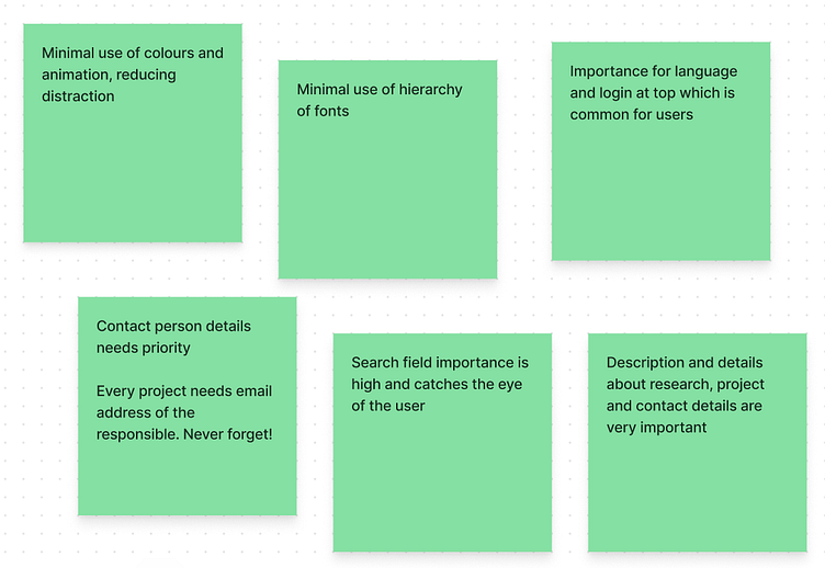
The project had a few glaring issues that needed immediate attention.
Firstly, the outdated and basic design required significant changes.
Secondly, crucial contact information like full name, email, telephone, and fax details needed to be prominently displayed.
Prioritizing the sorting of secondary information, such as campus addresses and room numbers, based on cognitive vision points was crucial.
Developing easily identifiable icons and user-friendly filters for research areas and expertise proved to be a challenging task. Additionally, ensuring convenient access to comprehensive information about each professor, including their professorship, faculty details, research publications, and ongoing projects, was essential.
Attention was even given to smaller details, such as differentiating faculties (departments) by their default colors in icons.
The search bar function underwent a complete revamp to facilitate effortless discovery and communication with experts.
Ultimately, the main focus was on providing a seamless experience in finding and contacting experts, including details about their research fields, areas of expertise, and contact information.
However, after intense scrutiny and criticism, we made changes to the expertise page, replacing dropdown menus with distinct sections like Overview, Publications, Research, and Contact in later iterations.
Competitive analysis
I did some research to find university websites with similar research and project works. One of the research assistant from the team also helped.
We looked few websites from TU Dresden and Federal Republic Ministry of Austria Education, Science and Research website.

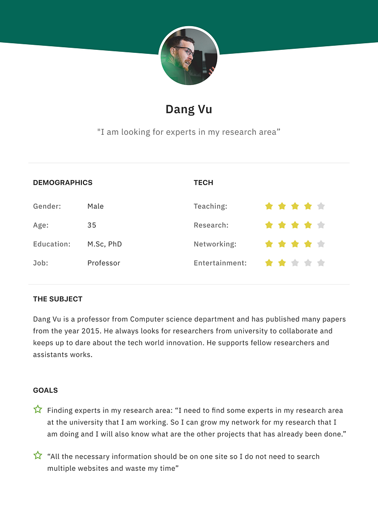
Persona
After some research and analysis, I created persona with their expectations and goals in my mind. It was helpful to begin my designing process.
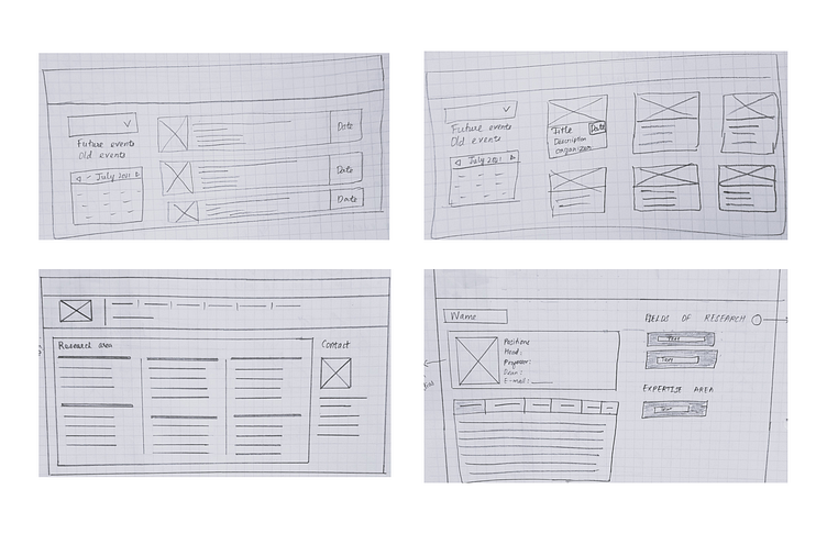
Low fidelity designs
I initiated the process by employing the traditional paper-and-pen method to sketch the wireframes, with a primary focus on the website application. It helped a lot during the process, to change some features through testing and feedback.
High fidelity designs
To ensure that the design met the user's requirements, I conducted user testing for over an hour for each pages with my supervisor.
This allowed me to see how users interacted with the interface and where they were having difficulties. I took note of all the observations in my logs and shared the latest version with the team for feedback.
Before handing it over to the development team, the design was thoroughly reviewed by a few other professors to ensure that it met the necessary standards.
Note: Some contents are blurred for data security reasons 🔐
Final statements
I can confidently say that this experience has been an amazing learning curve for me. I am grateful to my professors and researchers from the team for their guidance and support. Thanks to them, I was able to overcome my initial fears and hesitation and produce work that I am proud of.
Takeaways ✅
1) Brainstorming sessions and research part is very important before sketching.
2) Always draw your ideas by hand or in digital. The first thing comes out of your mind will be revised and will be made better.
3) Testing is important before giving the designs to the development team.
4) It is very important to document your work from the beginning. I have missed to document many things during revisions and only referred with emails since I was the only designer in the team, but now I learnt that documenting even a small feedback is very necessary and should not be skipped. So now I document everything in my design files even if I am working on a team or alone and I can come back easily and look.
Limitations
This is Chemnitz University of Technology’s webpage and available with limited access.
The website is still under development and due to regulations on data privacy and security many design details and works have not been shared in public.
Thank you for your time 😊