Kewar logo identity
"Kewar" logo design identity
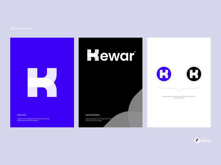
"Kewar" is a software company that focuses on developing custom web and mobile applications for businesses. The letter "K" in the logo represents the company's name and brand, and it is designed with a modern and sleek font that conveys the company's innovative and tech-savvy nature. The letter "K" is also stylized with a subtle gradient effect, giving the logo a sense of depth and dimensionality. The color scheme of the logo is a mix of blue and white, which creates a visual contrast that is both eye-catching and memorable. The blue color represents trust, reliability, and stability, which are qualities that the company strives to deliver to its clients. The white color, on the other hand, symbolizes energy, creativity, and passion, which reflects the company's dedication to providing innovative and cutting-edge solutions to its clients. Overall, the "Kewar" logo with the letter "K" is a simple yet effective design that effectively communicates the company's values, personality, and expertise to its target audience.
I hope this logo concept meets your expectations. If you'd like to make any changes or modifications, just let me know!
➟ Unused, Available For Sell $$$
Interested in working with me?
Let's make a mark, together!
Send Message on - WhatsApp | Telegram | Instagram | Linkedin
