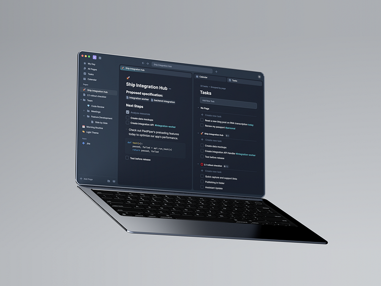
acreom UI Design: Tackling the Tab Challenge 🎯🔥
Hey there, fellow designers!
I wanted to share a new UI project we've been working on for acreom. We faced some interesting challenges, particularly when it came to designing the behavior and handling edge cases of tabs. 🎨
We know that tabs can be tricky; they need to be intuitive and easy to navigate, while still being visually appealing. That's why we paid extra attention to the user experience, ensuring that our tab design avoided the dreaded "tab problem" and provided a seamless experience for users by hiding tabs when navigating in single tab view. It creates smooth experience when tabs are visible only when you'll need them.
As always, I appreciate your feedback and would love to hear any suggestions for improvement. 🚀
More by SG View profile
Like


