Scaling Design Systems Dribble Course Capstone

Overview
Our capstone project for the Dribble Design Systems Course was split up into two phases. For the first phase, we were to take on the role as Head of Digital for IPTS: the Interplanetary Travel Syndicate - a bustling transportation network that shuttles people from world to world within our galaxy. We were tasked with the creation of three digital products.
Phase 2 was to simulate the leadership of IPTS hiring the prestigious branding firm MegaBrand to perform a rebrand of the entire organization. We would need to be able to quickly pivot and implement the branding changes into all 3 digital projects.
The end goal of this project was the creation of a comprehensive design system and utilization of the design system to make quick and consistent changes based on rapidly changing requirements for our products.
IPTS - Interplanetary Travel Syndicate
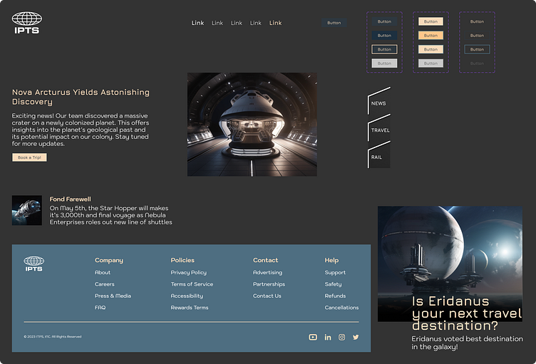
First steps of the project was to establish a clear understanding of the 3 product offerings from IPTS that we would be creating and for which we would be establishing a Design System. For our briefing, we were provided the logo provided by IPTS and short descriptions of the digital products we would be creating.
Digital Product Offerings:
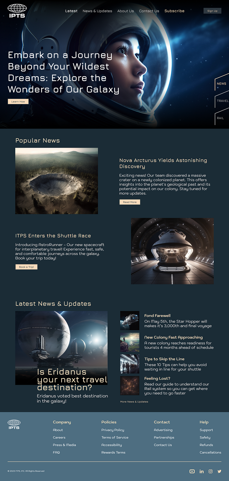
ipts.org - An informational website where you can find the latest news and happenings with the IPTS
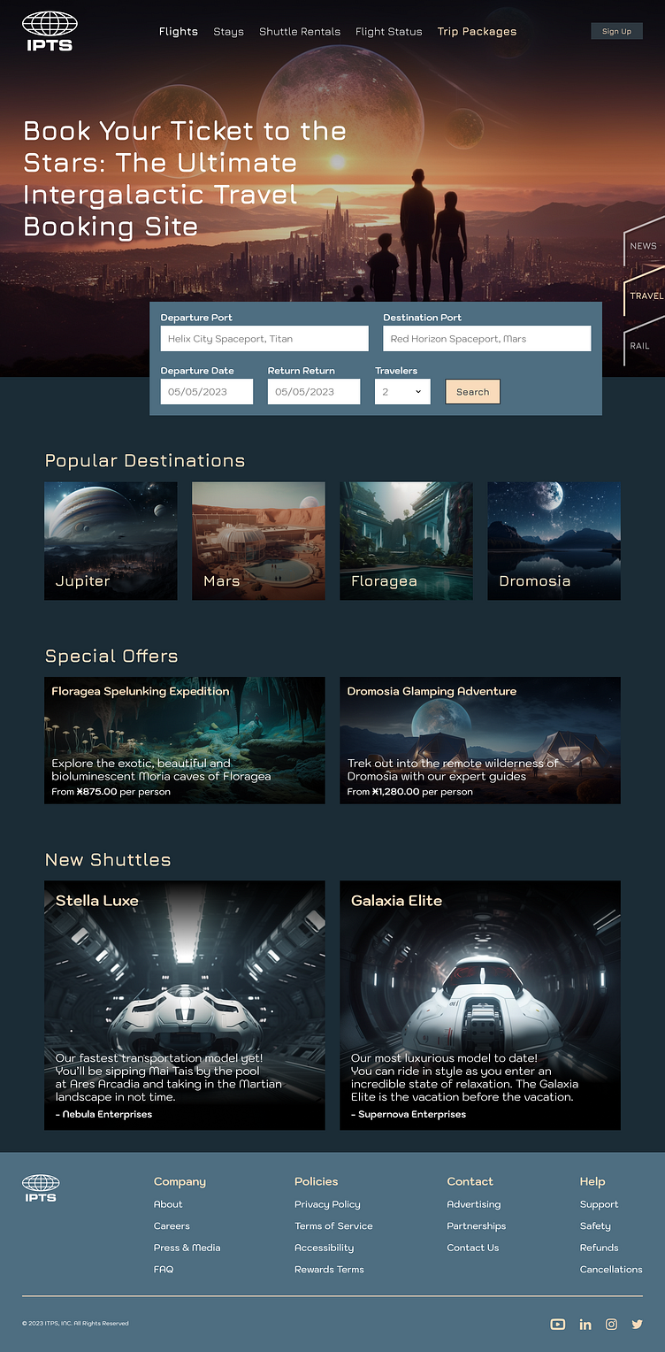
IPTS Travel - A website where you can browse and book travel to and from multiple destinations within our galaxy.
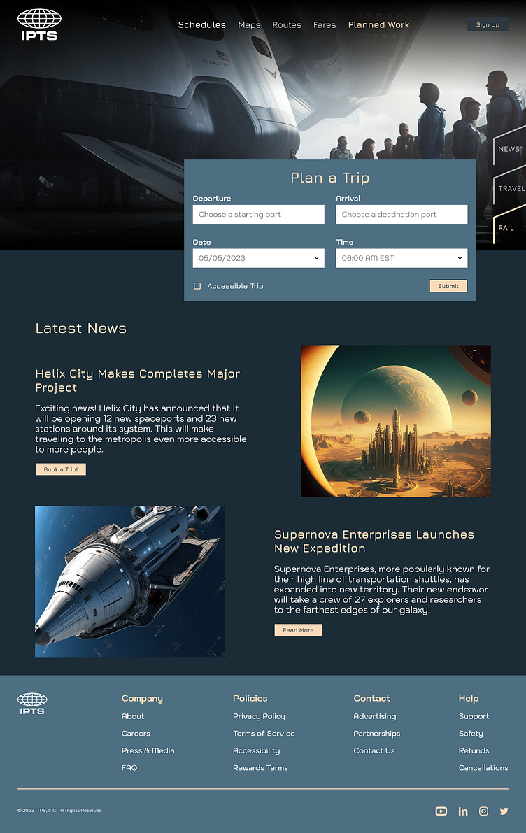
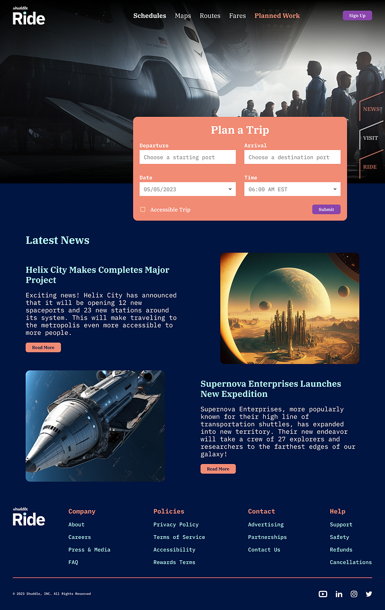
IPTS Rail - A real-time updated web app where you can view lines, routes, and times for all the different commuter lines.
Research Process
Now that we had a basic understanding of what IPTS needed, we moved into establishing what functionality would be required for each product. I began my search by looking into various newsletter websites, travel websites and metro/rail websites. This initial research allowed me to know which key features would be most effective within each project.
I analyzed key proponents of each site - UI patterns, visual design, component utilization, information architecture, etc.
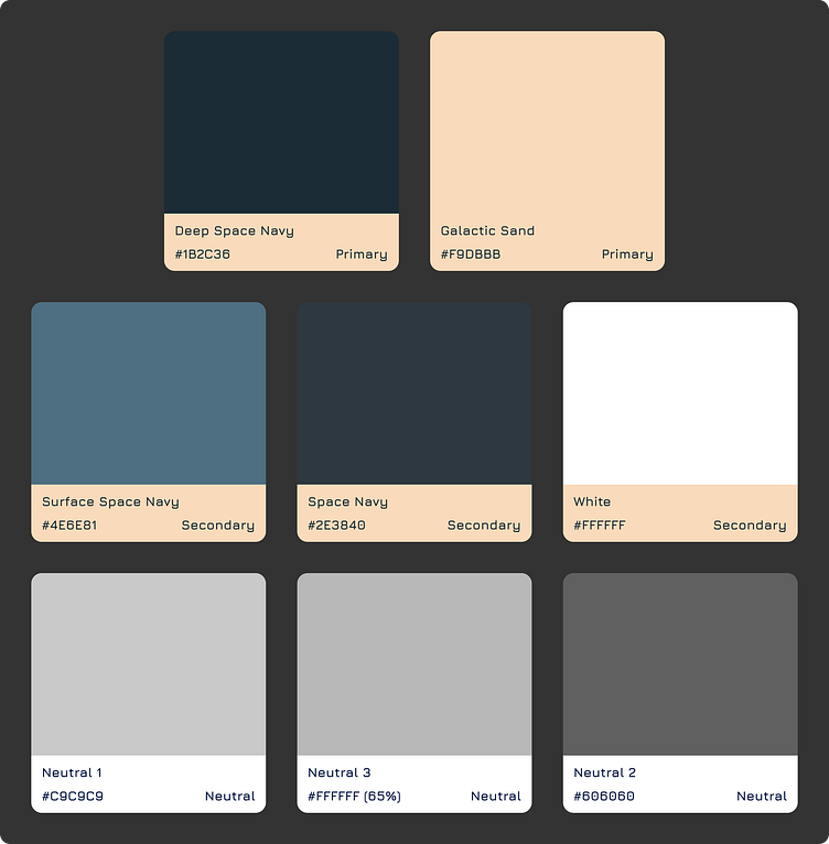
Visual Design
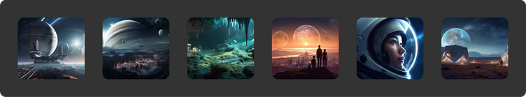
To help me establish the visual design of the 3 products for IPTS, I looked at space agency sites like Nasa and SpaceX. I also utilized Midjourney to create some stunning visuals to not only use as inspiration for the visual design of the products but also as compelling imagery in my designs. From this research and experimentation, I was able to establish a visual language that I felt would represent the goals and spirit of IPTS.
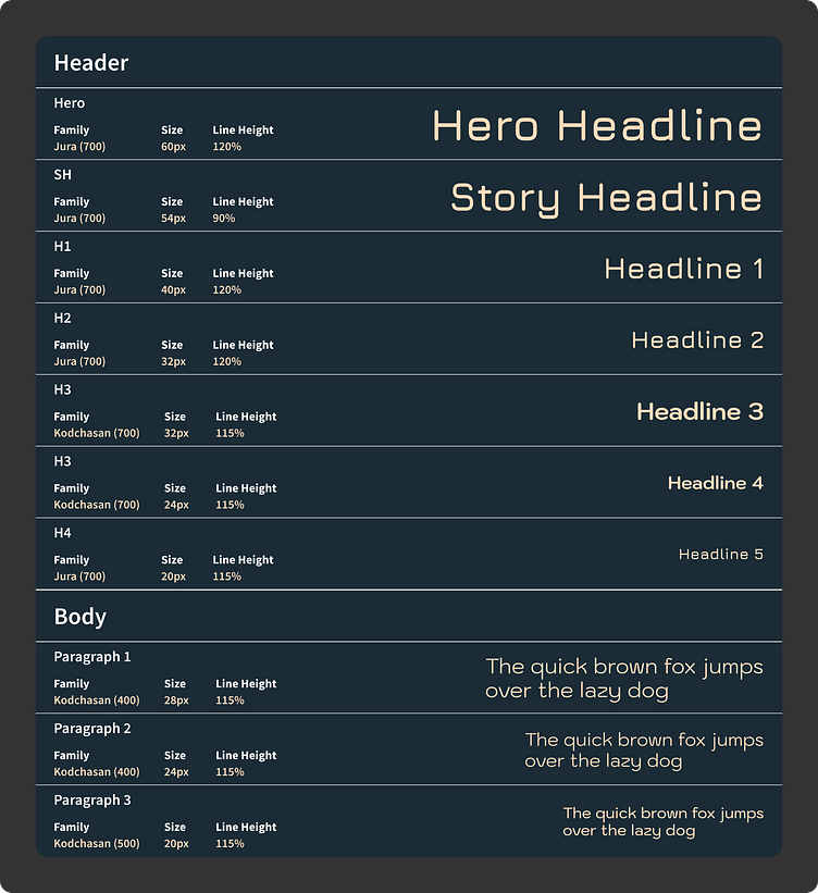
UI Patterns
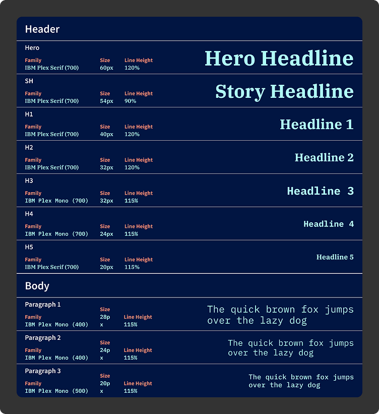
As part of my initial research I was able to identify common components that I could use as the basis of my design system for each of the websites. Once I had built out these components in Figma, it made the process of building the 3 websites so much more efficient.
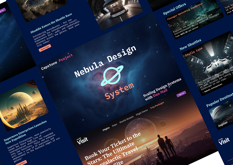
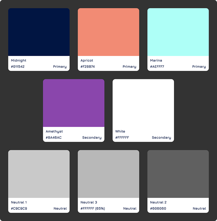
The Nebula Design System
Since we were able to establish a comprehensive design system through our work on the 3 websites for IPTS, we were able to easily make changes to our components, visual language and web pages based on the brand guidelines. This helped ensure that changes were consistent across all products, resulting in a cohesive and unified feeling throughout all 3 products.
In addition to the creation of the components and visual language in Figma, I chronicled the design system and its elements into a reference site using ZeroHeight. This reference helps to establish use cases for everything including color, typography and the reusable components in the design system.
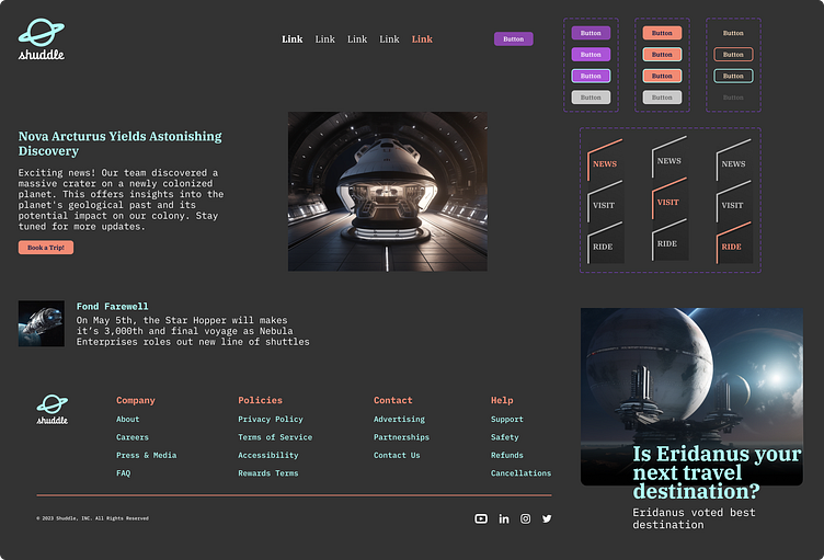
The Rebrand
With all the work done to create a design system, we were poised to be able to handle any changes that were handed down from the leadership of IPTS. These changes came in the form of a full organization rebrand, performed by the branding firm MegaBrand.
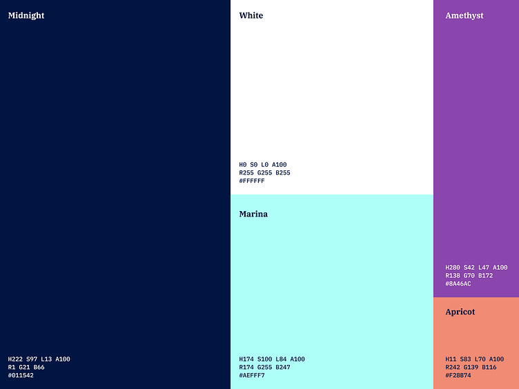
As part of the rebrand briefing we were given, we were told that MegaBrand was able to discover several key insights. IPTS wanted to appeal to a younger demographic. This would be accomplished by creating the feeling of a cool, new startup. We were given new colors, type faces, logos and a new name - Shuddle.
As part of the rebrand, we would need to rename the 3 websites to help establish a more friendly feel and cohesion between the products. This would make it feel more like a family of products rather then 3 independent offerings:
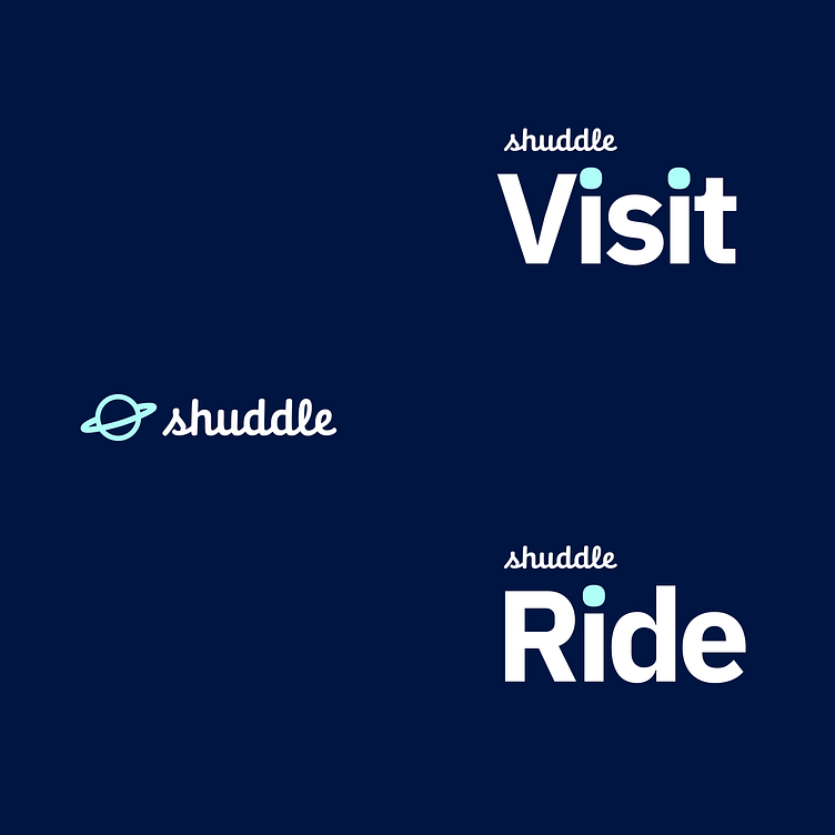
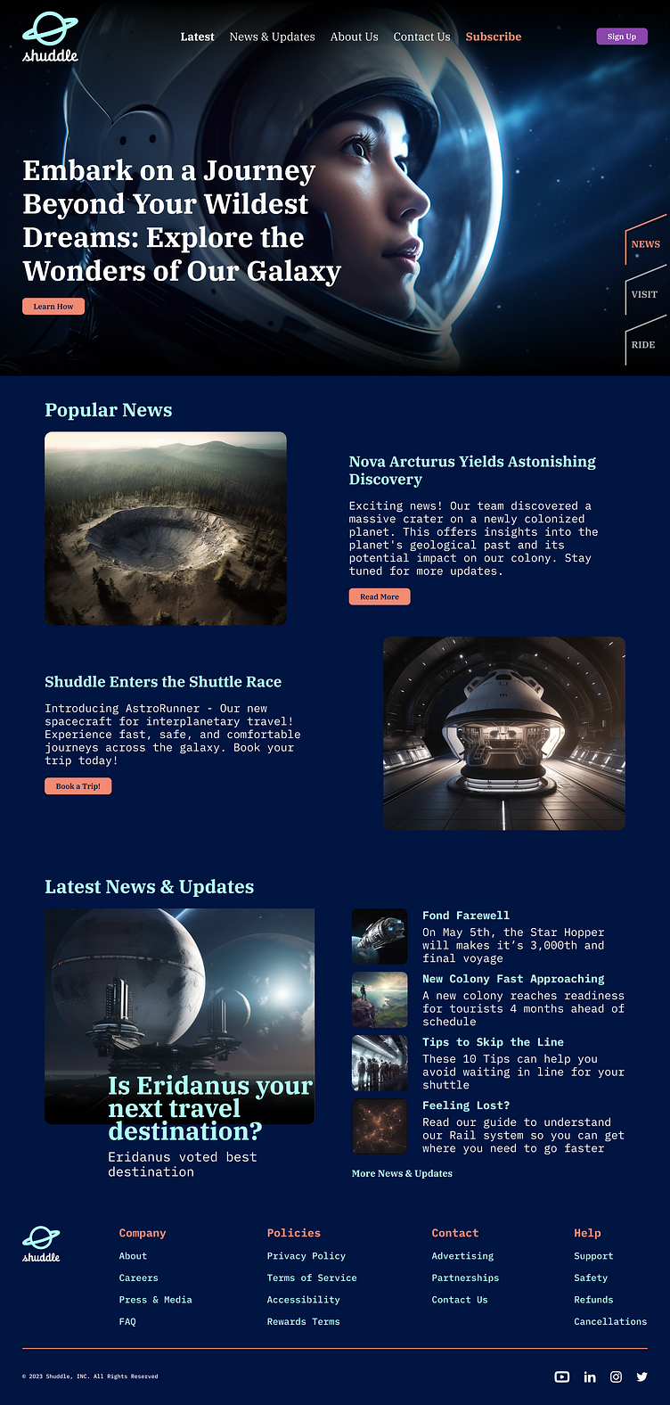
ipts.org is now shuddle.world
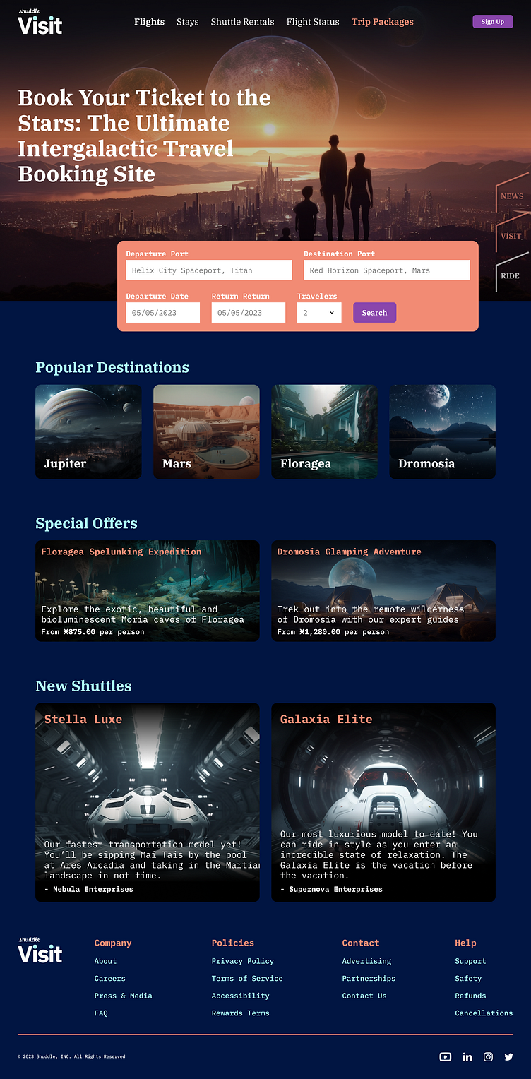
IPTS Travel is now Shuddle Visit
IPTS Rail is now Shuddle Ride
Updating Visual Language
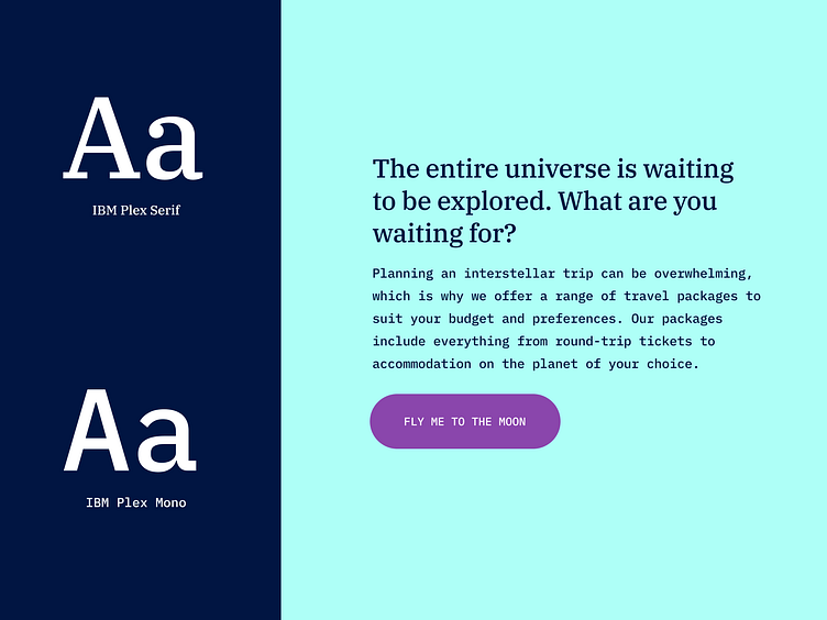
Now that we established the changes that needed to made to our 3 product offerings, our design system and visual language, it was a simple step of updating everything in our Figma designs.
Once the changes were made to our design system, it was a quick task to update our 3 products to give them a cohesive feel with the new brand guidelines. Having an established design system really made easy and fast to implement these changes.
In Conclusion
Having a design system to ensure our visual language and component utilization was consistent made a world of difference. Being able to quickly put together our initial 3 products for IPTS really reduced the amount of pressure on us to create these products. It also gave us the unique advantage of being able quickly and easily pivot in the face of massive changes. Allowing us to rapidly implement new requirements and guidelines without have to duplicate effort and creating a lot of added value to our products.
Resource Links