Nonprofit Design System
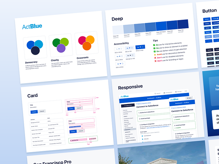
I created documentation for and enhanced an existing design system during my time at a progressive nonprofit. I focused primarily on creating detailed documentation for foundations and components.
The goal of this work was to improve design standards across multiple product areas. The product platform was long lived and had many different visual styles and interaction patterns of solving very similar problems. With a significant increase in product work incoming, improving design system documentation and standards aimed to improve delivery and end user experiences.
For this system, I managed Figma components, created documentation, and made contributions to frontend code alongside improving the developer experience of using our docsite on Storybook.
The screens below show the Figma-based documentation, where the long term goal was to have one source of truth for both designers and developers in Storybook.


