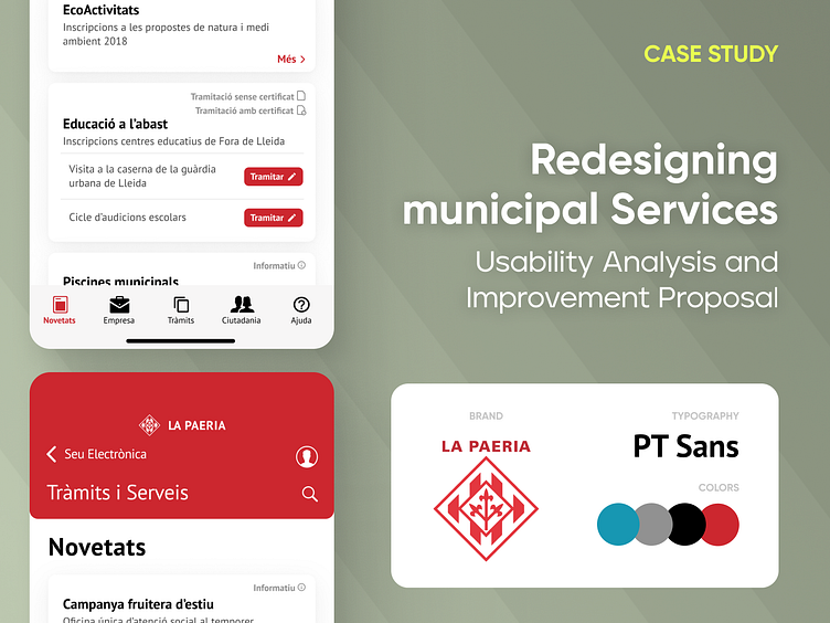
Redesign of online municipal services
Usability Analysis and Improvement Proposal
Today I want to share with you a project I worked on while studying computer engineering at university. It involves the redesign of a mobile web page with the goal of improving the user experience
To achieve this, I focused on simplifying the interface and making it easier to use. I removed unnecessary elements, used clear and simple icons to indicate different sections of the page, and adjusted the size and position of elements to make them easier to interact with on mobile devices
Regarding colors, I used a palette that matched the style of the original page, but made some adjustments to achieve a more attractive aesthetic. Instead of pastel tones, I opted for brighter and more saturated colors to catch the user's attention.
I am very satisfied with the result and I hope you like it as much as I do. If you have any comments or suggestions, I will be happy to hear them
Thank you for reading! 😊


