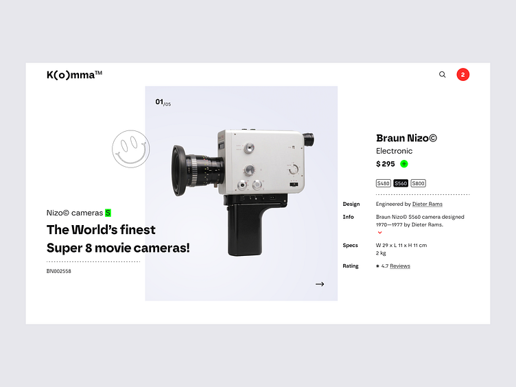
Braun Nizo product page
Exploring subtle design approaches to find a sleek balance between the original Braun aesthetic and how I would like to approach it. Wanted to break the usual, by applying a 13-column grid ☻
Having a hard time placing the navigation elements to scroll through more product photographs or suggestions?
↘ Sign up for exclusive access to digital goods & insights — https://neuwaive.com/
More by Bram Vanhaeren View profile
Like
