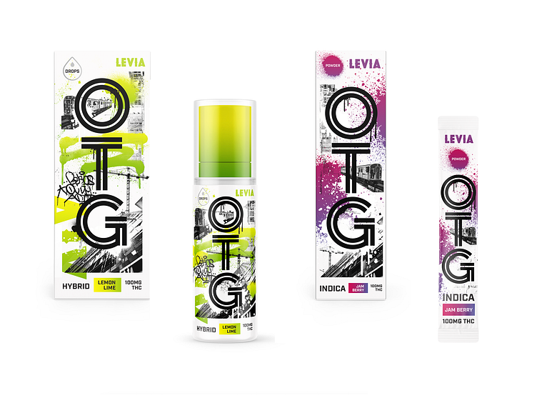
Packaging Concept 2
This was en exploration for new packaging for a Levia product. The direction was to create something that was urban, and had some energy to it. This is my comfort zone when it comes to how I design so this felt very natural and I loved the end result.
More by Jake Steele View profile
Like
