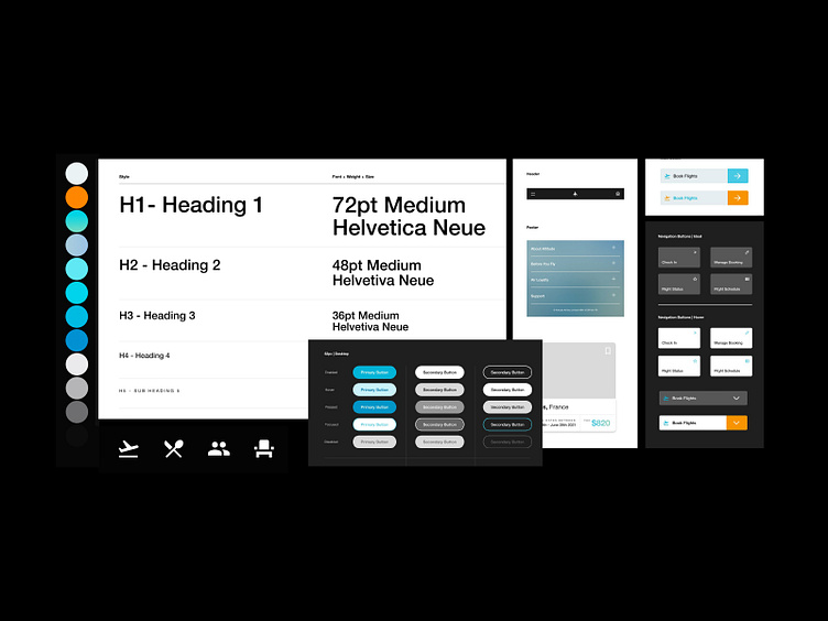
Altitude Airlines | Component Library
The component library was constructed by firstly selecting the type family, Helvetica Neue, to ensure the overall look and feel for the site felt functional, clean and modern.
The type family displays well as main headings and as body copy. The different weights allowed enough contrast that I didn’t feel the need to introduce a secondary font family. The heading styles work across desktop and mobile through testing different styles and weights.
The colour pallete was inspired by our ‘Blue Planet’ and uses a gradient to feature across ‘Special Deals’ on the site. The orange is used in contrast and very minimally across the site as it reads quiet strong. It was also important that the colours used across the site pass usability testing too.
Icons have a very important use across the site as they tie in the messaging and allow for less copy across the site. Too much copy on a website is tiring for the user to read and won’t allow for quick navigation through the UI.
