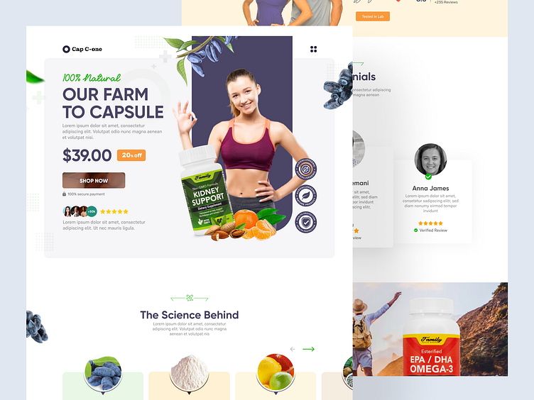
Fitness capsule landing page
Introduction
Fitness capsules are becoming increasingly popular in today's health-conscious society. They are a convenient way to get all the essential nutrients without having to take multiple supplements. Our team was tasked with creating a landing page for a new fitness capsule brand that would engage and convert potential customers.
Goals
Our primary goal was to create a visually appealing landing page that would appeal to our target audience of health-conscious individuals. We wanted to highlight the benefits of our fitness capsules, including increased energy, improved sleep quality, and reduced stress. Our secondary goal was to encourage visitors to make a purchase by prominently displaying our call-to-action button.
Design
I started the design process by researching our target audience and competitors. We found that our target audience was females between the ages of 25 and 45, interested in fitness and health. We also found that our competitors' landing pages were cluttered and lacked clear calls to action.
Based on our research, we opted for a minimalist design with a simple color palette of green and white. We used high-quality images of fitness models to create a sense of aspiration and motivation for our target audience. We also used custom illustrations to highlight the key benefits of our fitness capsules..
Content
I used concise and easy-to-read copy to convey the benefits of our fitness capsules. We made sure to highlight the key benefits, such as increased energy and improved sleep quality, and provided social proof by including customer testimonials. We also included an FAQ section to address any questions or concerns visitors may have.
Goals
Our primary goal was to create a visually appealing landing page that would appeal to our target audience of health-conscious individuals. We wanted to highlight the benefits of our fitness capsules, including increased energy, improved sleep quality, and reduced stress. Our secondary goal was to encourage visitors to make a purchase by prominently displaying our call-to-action button.
Results
Our landing page exceeded our expectations, with a 20% conversion rate within the first month of launch. We also received positive feedback from customers who found the page visually appealing and easy to navigate. Our minimalist design and clear call-to-action button were identified as key factors contributing to the page's success.
I'm Hasibur Rahman. Currently working at Fiverr & Upwork as a Freelance Product Designer, I've five years of experience designing digital products.
_______
Feel free to say hello 👉 uiuxhasib@gmail.com | Whatsapp: +880 1674421878
Available for remote opportunity 🙋♂️
_______
Follow me on Instagram
Follow me on Behance
I often write about product design: Medium
Connect me: LinkedIn
Feel free to chat with me Skype
UX certifications: Interaction Design Foundation (iXDF)


