Blink Bikes UX Case Study

Website name: Blink Bikes
Tagline: Become the new premium
Description: "Blink Bikes" is an exclusive e-commerce website that specializes in selling high-end bicycles to high earning clients. With a focus on providing a cohesive shopping experience and an extensive range of premium bikes, the website caters to the needs of those seeking an elevated cycling experience.
Overview
My Role: User Researcher, User Tester, Product Designer, Product Developer, User Experience Designer, Interaction Designer
Duration: January 2023 - March 2023
Tools: Figma, Adobe Photoshop
Challenge
To increase the customer conversion rate by improving the shopping to checkout process.
Solution
Blink Bikes aims to provide a luxurious yet functional cycling experience to high-earning clients. The goal is to offer an exclusive e-commerce platform that provides a seamless shopping experience. The website is designed to cater to the needs of its target audience, 24-38 year old high income earners. with a user-friendly interface that promotes intuitive navigation, secure and quick payment options, exclusive discounts, and the ability to compare and contrast products. These features ensure that customers can acquire a bike that caters to their specific needs with ease and security.
01 - Discovery
What are competitors doing?
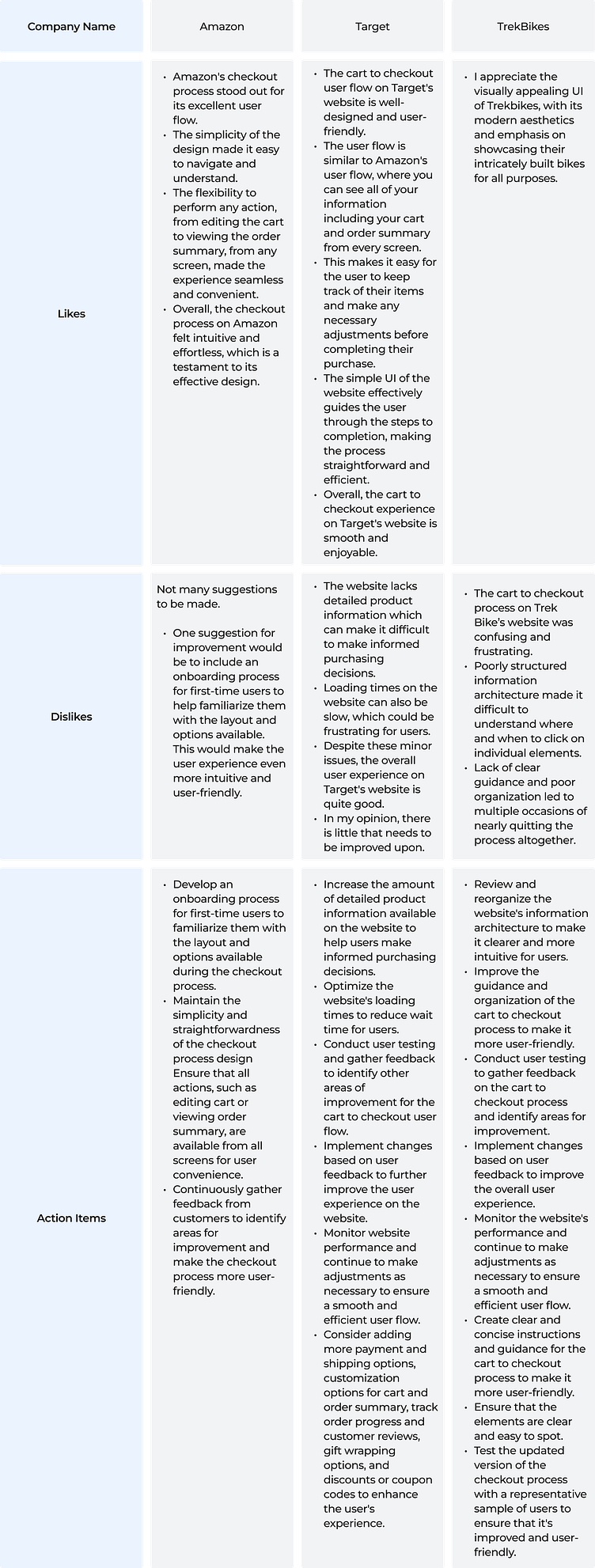
I started by researching three existing platforms that serve a similar purpose and performed a heuristic analysis compiling a list of likes, dislikes, and actionable items for each, then creating a list of 5 overall actionable items to implement into the design and research of Blink Bikes.
Information availability: Increase the amount of detailed product information available on the website to help users make informed purchasing decisions.
Ease of access and navigation: Review and reorganize the information architecture of the website to make it clearer and more intuitive for users
Ideate - Test - Validate: Conduct user testing and gather feedback to identify other areas of improvement for the cart to checkout user flow.
Maintenance and upkeep: Implement changes based on user feedback to improve the overall user experience and monitor the website's performance to ensure a smooth and efficient user flow
Website load efficiency: Optimize the website's loading times to reduce wait time for users and bounce rates.
Amazon's checkout process is often cited as a gold standard in e-commerce, thanks to its simple and straightforward layout that makes it easy for users to navigate and understand. The flow is flexible and convenient, allowing users to perform any action, such as editing their cart or viewing their order summary, from any screen. The user flow is designed with minimal clutter and distraction, with each step clearly labeled and easy to complete, resulting in a smooth and enjoyable experience for users.
TrekBikes has a visually pleasing UI with a modern aesthetic that showcases their products well. However, the cart-to-checkout process is confusing and frustrating due to its poorly structured information architecture, lack of clear guidance, and poor organization. This makes it difficult for users to understand where and when to click on individual elements. In contrast, Target's cart-to-checkout user flow is user-friendly, straightforward, and efficient, with a simple UI that guides the user effectively, similar to Amazon's user flow.
OVERALL RATING
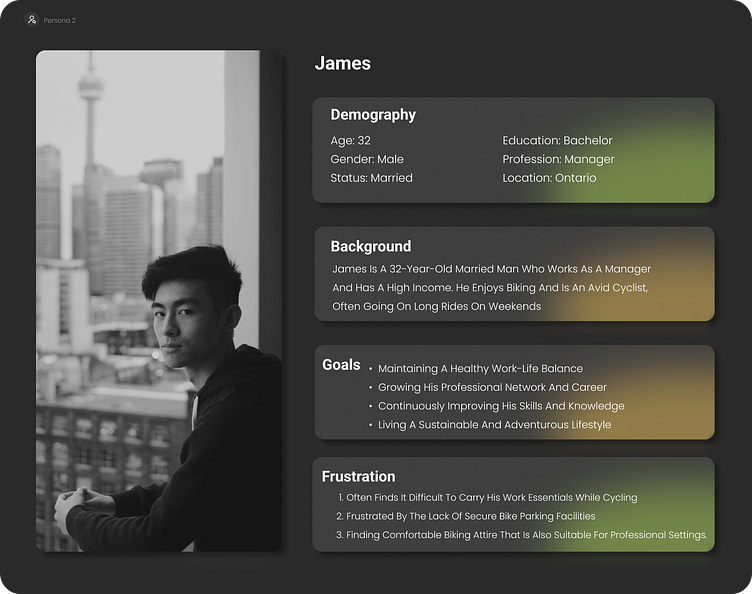
Who is my audience?
Using a combination of subject interviews and empathy mapping, I crafted the following persona.
What do users want?
When asked about potential use cases associated with their challenges, users identified the following as their top priorities:
I want to set up financial goals so I have a visual reminder of what I’m working towards.
I want to set a custom budget so I can determine exactly where my money goes.
I want to set up automatic bill pay so I never have to worry about my bills being paid on time.
I want proactive advice and recommendations on the best course of action that feels more personable rather than another tool I have to use.
I want to create and access my account from any device wherever I am.
I want to check my balances so I know how much money to allocate to different goals.
I want to be able to move my money from one place to another with ease.
I want to receive regular updates and notifications so I don’t have to remember to look up my financial information.
I want to customize my notifications so I can control what I get notified about and when.
I want to be able to contact support and receive help if anything goes wrong
.
02 - Key Insights
03 - Design & Development
Who or what is Blink Bikes?
Goal: Improve the conversion from browse to completion of checkout to increase revenue on the product’s web experience.
Brand Name: Blink Bikes
As an athlete myself, I understand that cycling may not be just a hobby but often a lifestyle. The platform is designed to cater to the needs of high-income bikers who demand the best in class quality and service. From mountain bikes to road bikes, a wide range of products are offered to tailor to the needs of discerning riders.
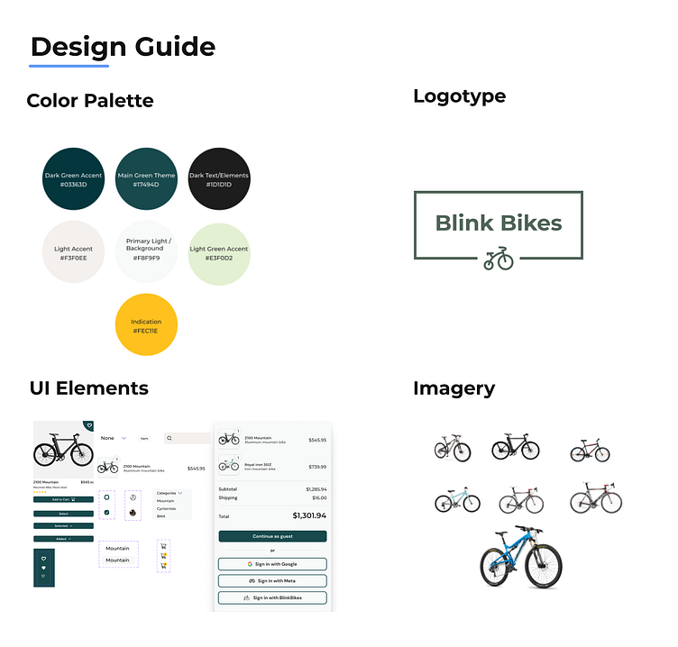
Brand Attributes: When thinking about user goals and adoption, I wanted the brand to adhere to three main goals to best suit the demographic we cater to:
Growth: Green is a color that is associated with growth and renewal, making it the perfect color to represent a brand that is constantly evolving and expanding.
Balance: The combination of green and white creates a sense of balance and harmony, which can be used to emphasize the importance of a healthy work-life balance, or to showcase the benefits of a balanced lifestyle.
Activity: Because we service an active audience, I wanted users to feel connected to the brand that understands and relates to their needs.
Colors, fonts and typography: A mix of DM Sans and Montserrat were chosen to convey a sense of invitation and simplicity as two welcoming and unintrusive sans-serif typefaces that also scale well between titles, headers, and body text. The font weights varied between bold, semi-bold, and medium respectively.
Imagery + Iconography: Imagery for this brand was mainly used to display the products, however; imagery was also used to convey activity and to demonstrate, and hopefully convince, potential users that their lifestyle will be similar to those in the pictures after their purchase.
Overall design: A simplistic and intentionally minimal design enhances the experience, removes barriers to entry and engagement, and welcomes users on a journey that gets them acclimated and using the product quickly and easily, while also making use of popular convention.
How does MIA work?
Using the user stories as a starting point, I wanted to set up an intuitive workflow that also solved for the attributes they desired most in the app. In addition to easy set up, the app needed to:
Send users motivational push notifications that encourage them to stay on track and continue their financial journey.
Provide the user with quick hits of accurate, real-time financial information so they can deepen their financial knowledge each time they engage with the app.
Include customization options, such as the color theme, so the user feels more connected to the app.
Does MIA work?
Tests were conducted with five participants between the ages of 16-29 years old. The goal was to determine product quality and seamlessness of the experience to promote adoption and repeat usage. The test objectives were to uncover usability and other technical issues within the red routes of the product. Two key questions to answer were: Is our prototype seamless and how do users navigate our product. The test tasks were as follows:
Task 1: Add a goal
Task 2: Add a bill
Task 3: Add a payment gateway
Task 4-5: Add a goal and bill from the dashboard
04 - The Final Product
I designed MIA to feel modern, lightweight and easy to use. Its simplicity is its central asset. It maintains a strong screen presence by guiding the users’ eyes directly to the information hotspots while simultaneously controlling the flow of information on the page. Users meet little to no resistance at every point of interaction and can learn the basics of budgeting while growing their financial acumen at a pace that relates to their specific situation.
Key Takeaways
My first UX case study on the app "MIA" taught me the importance of preparation and iteration in the design process. Through thorough planning and multiple revisions, I was able to create a minimalistic and functional app that effectively uses signifiers and allows for future improvements in the user experience. One key takeaway was the importance of collecting quantitative research in future iterations to further optimize the design. Overall, I am satisfied with the final product and am confident that it serves its purpose and provides a pleasing user experience.
Future Roadmap
Implement Quantitative Research: As mentioned in the conclusion, collecting quantitative research data is crucial for optimizing the design further. This can be achieved by conducting user testing sessions with a larger sample size and using analytics tools to track user behavior and interactions within the app. This data can be used to identify pain points and areas of improvement that were not apparent during the design process.
Address User Feedback: Feedback from users can be used to address any concerns or issues they may have with the app. Conducting surveys or feedback sessions can provide valuable insights on user preferences and expectations. This information can then be used to refine the design and improve the user experience further.
Incorporate New Features: As technology advances, it is important to stay up to date with the latest trends and innovations. Adding new features can keep the app relevant and engaging for users. However, it is important to carefully consider which features to include and how they will impact the overall user experience.
Evaluate App Performance: Regularly evaluating app performance can help identify any technical issues that may arise. This can be done by monitoring app crashes, response times, and other performance metrics. Addressing these issues promptly can help maintain user satisfaction and prevent any negative impact on the app's reputation.
Continuously Iterate: Finally, it is important to remember that the design process is never truly finished. Continuously iterating and refining the app can help keep it relevant and competitive in the market. This can be done by using feedback, conducting research, and staying up to date with the latest design trends and technologies.
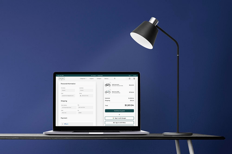
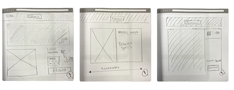
How does Blink Bikes work?
Using the user stories as a starting point, I wanted to set up an intuitive flow that also solved for the attributes they desired most in the app. In addition to conventional UI and intentional limitation of information on the screen at once, the app needed to:
Build trust with customers on our checkout page
Offer clear and compelling reasons for customers to complete their purchases
Streamline the checkout process and minimize steps and fields
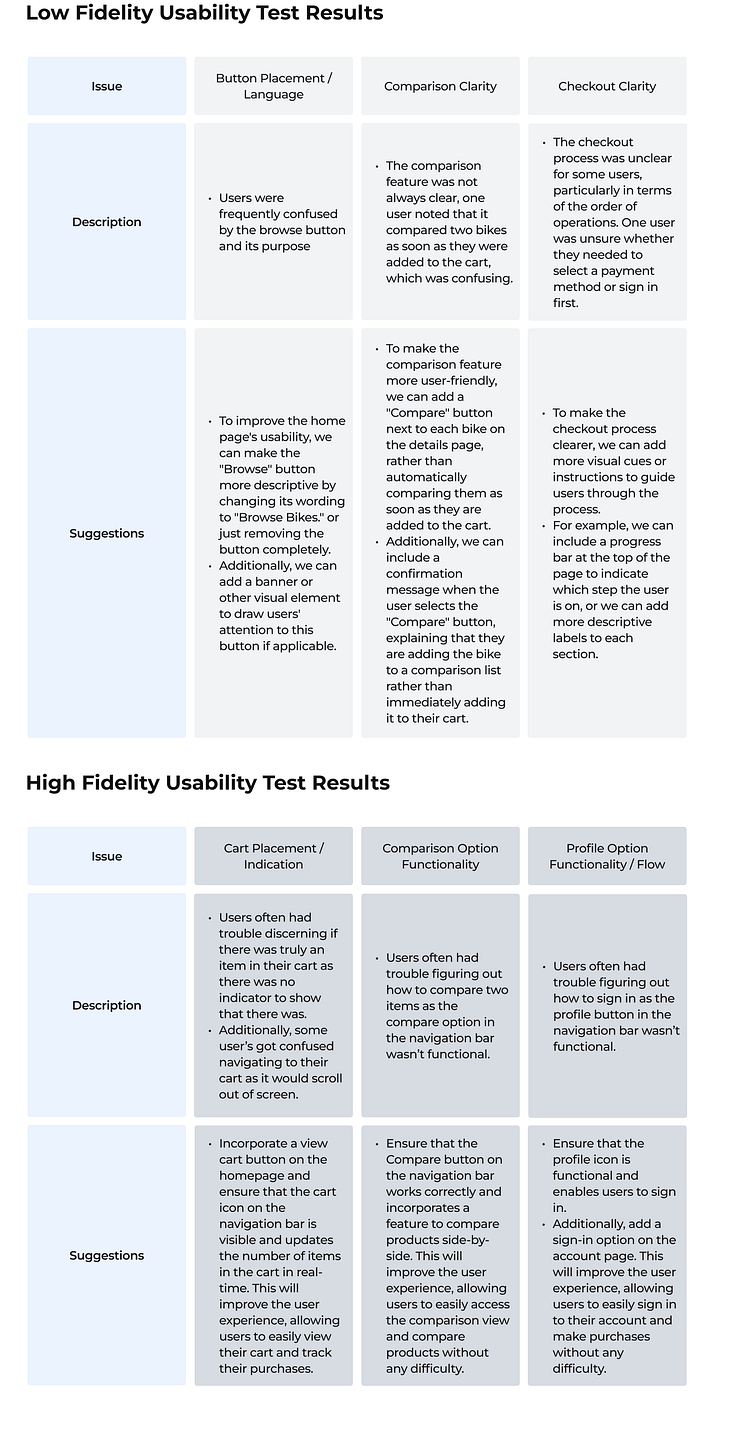
Does Blink Bikes work?
Two rounds of usability tests were conducted, one low fidelity and one high fidelity. The intended test demographic was originally meant to be conducted on users between the ages of 24 - 38, majority men, high-income earners. Unfortunately, I didn’t and still don’t have immediate access to anyone who fits this criteria. I, instead, tested close friends of family, some of whom are actively in the bicycle market and some not. Regardless, these tests provided valuable insight into the overall usability and intuitiveness of the platform.
The goal was to determine product quality and seamlessness of the experience to promote adoption and repeat usage. The test objectives were to uncover usability and other technical issues within the red routes of the product. Two key questions to answer were: Is our prototype seamless and how do users navigate our product? The test tasks were as follows:
Task 1: Add two bikes, the Z100 Mountain and the Royal Iron 315Z to the cart
Task 2: Compare these two bikes using the side by side view feature
Task 3: Sign in using meta to continue checkout
04 - The Final Product
I designed Blink Bikes to feel active, simplistic and intuitive to use. Simplicity is its central asset. It maintains a strong screen presence by guiding the users’ eyes directly to the information hotspots while simultaneously controlling the flow of information on the page. Users meet little to no resistance at every point of interaction and can efficiently use the information available to make an informed decision on what bike will suit their needs best.
Key Takeaways
Designing Blink Bikes has taught me several valuable lessons about user experience.
First and foremost, simplicity is key. By prioritizing simplicity in the design, I was able to create an intuitive and easy-to-use interface that allowed users to access the information they needed without feeling overwhelmed.
Secondly, guiding users' eyes to the information hotspots and controlling the flow of information on the page is crucial. By doing this, I was able to ensure that users could quickly and easily find what they were looking for without having to navigate through unnecessary clutter.
Additionally, designing for a seamless user experience is essential. I aimed to minimize resistance at every point of interaction, making sure that users could efficiently use the information available to make informed decisions about which bike would best suit their needs.
Finally, I learned the importance of putting myself in the users' shoes. By empathizing with the users and understanding their needs and pain points, I was able to create a design that truly met their requirements.
Overall, designing Blink Bikes has been a valuable experience that has taught me many lessons about effective user experience design. I am excited to continue to apply these lessons to future projects and further refine my skills in this area.
Future Roadmap
Based on my experience designing Blink Bikes, I have identified several areas for future improvement and development.
Firstly, I plan to conduct further user research to gain a deeper understanding of user needs and preferences. This research will inform the design of future iterations of the Blink Bikes interface, with the goal of creating an even more intuitive and user-friendly experience.
Secondly, I will continue to refine the design of the information hotspots and the flow of information on the page, with the aim of further improving the user experience. This will involve ongoing testing and iteration to ensure that the interface remains efficient and streamlined.Thirdly, I plan to explore ways to enhance the interactivity of the interface, such as through the use of animations or other visual cues. This will help to make the experience more engaging for users and could further improve the usability of the platform.
Finally, I will continue to prioritize simplicity in the design, aiming to create a clean and uncluttered interface that makes it easy for users to find the information they need. This will involve ongoing refinement of the design and careful consideration of how to present information in a way that is both effective and efficient.
Overall, the future roadmap for Blink Bikes involves ongoing refinement and development of the user experience, with a focus on creating an even more intuitive, engaging, and user-friendly interface.
Final Thoughts
In conclusion, my case study on Blink Bikes e-commerce website design highlights the significance of an iterative and user-centered approach in creating a successful user experience. By conducting thorough user research, including surveys, user interviews, and usability testing, we gain valuable insights into the needs and pain points of our target audience: high-income earners looking to purchase premium bikes. These insights inform the design decisions and help create a visually appealing and intuitive website that meets user needs while aligning with business goals.
The use of interactive wireframes and prototypes facilitates stakeholder buy-in and ensures that design decisions are made in a collaborative environment. Iterative design allows for feedback from users, leading to improvements in the user experience, such as optimizing the checkout process and integrating a comprehensive bike comparison tool.
Furthermore, the website's design emphasizes the use of high-quality visuals and clear product information, conveying the quality of the bikes and creating an aspirational feel that resonates with the target audience. The use of persuasive design techniques, such as social proof and scarcity, helps encourage conversions and drive sales.
In summary, the Blink Bikes e-commerce website design project results in a visually appealing, user-friendly, and effective platform that successfully meets business goals and user needs.