PostUp (Google Ventures Design Sprint)

Challenge:
Develop a mobile-only application that helps users find places that already exist in their desired location. The service will cost $5.99 per month for unlimited access to the app. As a result, this app will require a high-impact design that highlights the helpful attributes and amenities of each location so the user can make an informed decision as to where to go.
My Role
User Researcher, User Tester, Product Designer, Product Developer, User Experience Designer, Interaction Designer
Duration
5 day design sprint
Tools
Figma, POP by marvel, Slack
3 Key Attributes to Success
PostUp solicited feedback from remote workers and freelancers about their experiences locating public places that are appropriate for working. Some users want a place to post up for an hour or two between meetings or to work from all day. When traveling to a new area of their city or traveling out of town, users also want a reliable method for locating great places to work where they are in unfamiliar territory. Right now, it takes users more time to look for a place to work instead of working, only to find that the place they selected doesn’t meet their requirements.
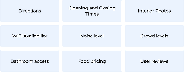
The main attributes users are looking for are as follows:
Noise level:
A quiet place to work, make phone calls and hold video chats with little background noise or crowds
Seating & Crowds
A place with ample seating to hold quick in-person meetings with colleagues or stay for long periods of time without having to make a purchase or being asked to leave
Amenities
Free and reliable access to WiFi and electrical outlets with access to bathrooms and good food.
PostUp will help users spend less time finding public places to work that has the basic amenities they need, and more time working.
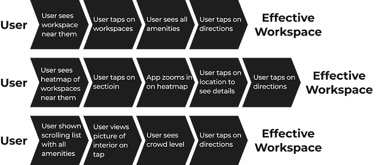
01 - Mapping
Think AirBNB for quiet workspaces
On Day 1, I started to think about the PostUp’s benefits and the pain points it was solving. This app needs to address the primary needs of freelance, remote, and hybrid workers — finding a suitable public workspace in which to work. Ideally, the app will not only help speed the process of finding the best location but clearly illustrate the key amenities that are present in the location.
This map represented possible end-to-end user flows that have since been implemented into the product via an amalgamation of all their key traits. It illustrates the various steps and actions that a user takes from start to finish, providing a clear visual representation of the user experience. By mapping out these user flows during the development process, I was able to ensure a thorough analysis of the user journey and make necessary improvements to enhance the overall user experience.
02 - Sketching
Lightning Demo Research
On Day 2, I participated in three lightning demos with Airbnb, Yelp and Foursquare to seek visual inspiration. These apps have high user adoption and leverage location based data to connect with user needs.
Airbnb
I was immediately struck by how organized and aesthetically pleasing the Airbnb app was.
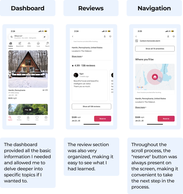
Overall, the demo guided me through the entire flow seamlessly, providing a smooth and enjoyable experience.
Yelp
Yelp seemed particularly strong in providing useful information for people to find what they want and learn how to get there.
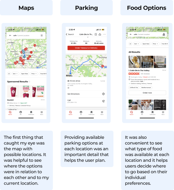
Overall, the lighting demo provided useful and relevant information that helped me make an informed decision about the direction in which to take PostUp.
Foursquare
During the lightning demo, I explored the features of FourSquare and found that the data was displayed in a more quantifiable way, making it easier for me to understand and compare different options.
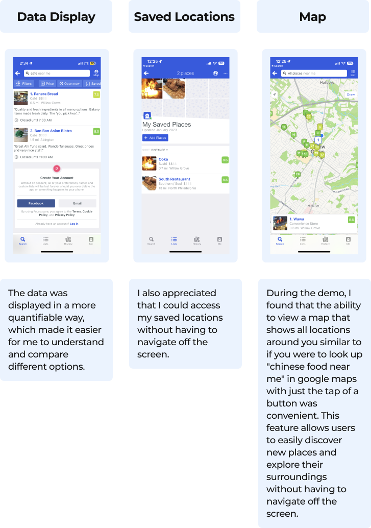
Overall, I found the design a bit bland and uninteresting, but the demo provided useful information and helpful features that made it easier for the user to make a decision.
Sketching Process
In order to draw inspiration from my user flows and incorporate key components into my own design, I utilized the Crazy 8's UX sketching technique. This technique involves rapidly sketching eight different design concepts in eight minutes, allowing for a wide range of ideas to be generated quickly. By utilizing this technique, I was able to brainstorm and explore different possibilities for my design without getting bogged down in the details. This approach helped me to identify key elements from each user flow that I could incorporate into my own design, such as easy access to saved locations and the ability to view a map with all nearby locations. By using the Crazy 8's technique, I was able to generate a variety of ideas and quickly identify the most promising concepts to incorporate into my design. This technique is particularly helpful in this situation as it allowed me to create a lot of different options to pick from, without spending too much time on any one design.
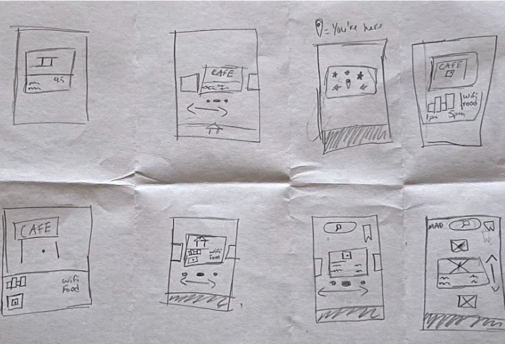
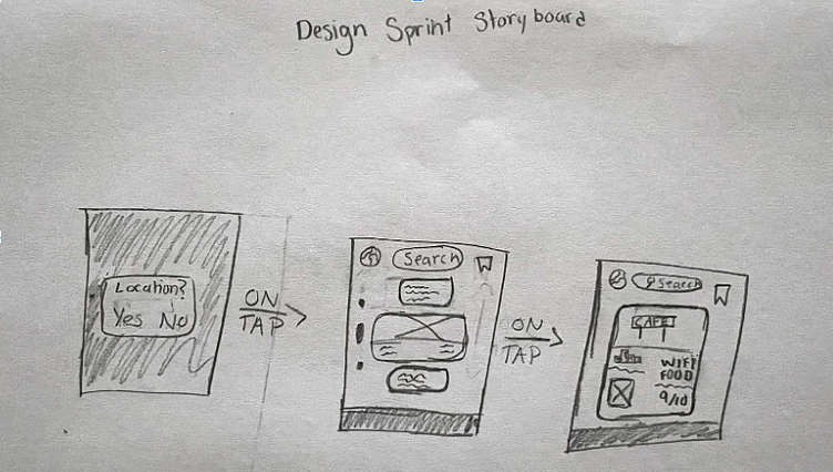
I chose the final scene in the Crazy 8's sequence to be my critical screen for my 3 panel storyboard because it met all the criteria that I was looking for. It translated the best from paper to a live prototype, included different aspects from each lightning demo, and had the best overall UI/UX conversion. It was the best representation of my design vision and had the most potential for success as seen below.
03 - Decision
Airbnb Becomes My Leading Inspiration
On the third day of my design process, I made the decision to heavily influence the design of PostUp by the user-centered and intuitive design system of the Airbnb app. However, I also recognized the value in incorporating key elements from other industry leaders such as Foursquare and Yelp, these include:
Foursquare's method of quantifying ratings
Yelp's built-in map and navigation system to make the user experience more seamless.
Price-point metric from both Foursquare and Yelp, using a series of dollar signs ranging from "$" to "$$$" to indicate the cost of a listing.
Overall, these decisions were made in order to create a more intuitive, user-friendly design that aligns with the needs and preferences of the target user group.
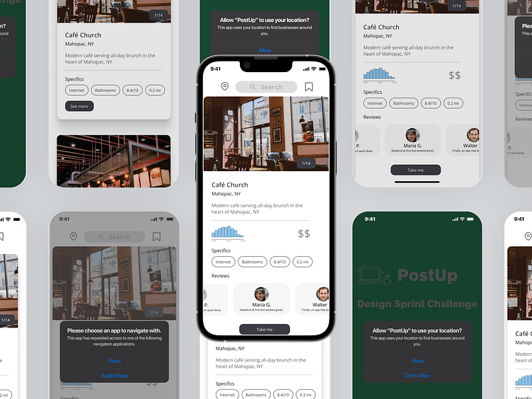
04 - Prototype
Verifying Assumptions through Effective Testing Strategies
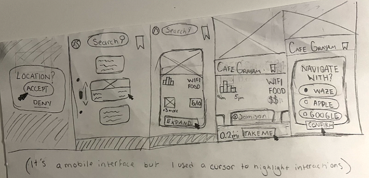
On Day 4, I developed the prototype for usability testing so I could evaluate the effectiveness and efficiency of the wireframe for the PostUp app brief. The prototype for this design is a low fidelity illustration of this process and was created by simply translating the wireframes into a more interactive format.
The interactive prototype can be found here.
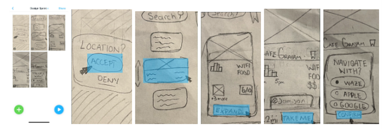
Testing focused on the user flow from opening the app and enabling location services to navigating to the desired destination. This was crucial in determining how intuitively users understood the purpose and options on each screen. The design of the app was heavily influenced by the user-intuitive and aesthetically pleasing design system of AirBnB, and it was important to understand if users were able to navigate the app with the same level of ease. The results of the usability testing provided valuable insights into the effectiveness of the wireframe and informed necessary changes or adjustments before the final app was developed.”
05 - Testing
Does the PostUp prototype work?
On Day 5, I commenced the usability testing process by interviewing five participants, four of whom were college students and one who is employed full time. Their ages ranged from 18 to 21, and they all fit the target demographic for the app. Scheduling was somewhat challenging due to the approaching holiday season, but I was able to conduct the interviews without too much difficulty.
Overall, the interview process went smoothly. During the usability testing, most participants seemed to feel comfortable with the non-academic setting of the dormitory, however, some participants expressed concerns regarding the repeated nature of the interviews. To alleviate these concerns, I emphasized that the testing was solely focused on the app and not on their abilities as individuals, I also reassured them that there were no wrong answers and that their feedback was valuable for the improvement of the app. The testing provided valuable insights that I incorporated into a mid-fidelity wireframe, although it was not required by Springboard.
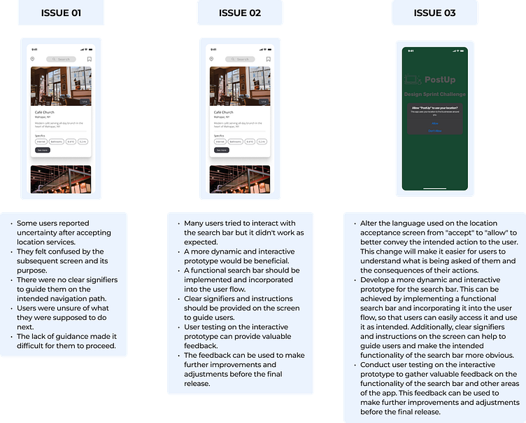
Based on my findings, the main pain points for users were located on the second screen of the app..
Key Takeaways
During the 5-day GV Design Sprint for 'PostUp', as the sole designer, I learned several key takeaways. Firstly, ideation and rapid prototyping allowed me to generate and test multiple solutions in a short amount of time. Secondly, user testing and feedback were critical for identifying user pain points and iterating on the design. These insights enabled me to design a more comprehensive and effective solution for connecting workers on the go with efficient workspaces.
Future Roadmap
Alter the language used on the location acceptance screen from "accept" to "allow" to better convey the intended action to the user. This change will make it easier for users to understand what is being asked of them and the consequences of their actions.
Develop a more dynamic and interactive prototype for the search bar. This can be achieved by implementing a functional search bar and incorporating it into the user flow, so that users can easily access it and use it as intended. Additionally, clear signifiers and instructions on the screen can help to guide users and make the intended functionality of the search bar more obvious.
Conduct user testing on the interactive prototype to gather valuable feedback on the functionality of the search bar and other areas of the app. This feedback can be used to make further improvements and adjustments before the final release.