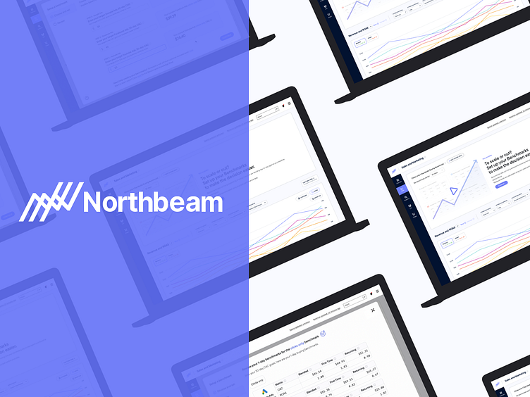
Northbeam: 1 day media buy benchmarks
1-day media buying is a web-based experience that helps media buyers create 1-day media buying benchmarks to ensure they are staying on track to reach their 30, 60, or 90-day metrics.
Challenge
For the majority of media buyers who run ads across platforms such as Facebook, Google, and Youtube, media buying success metrics are reviewed at either 30, 60, or 90-day windows.
The issue with these lengthy windows is there is no real way to measure if they are on track to hit those numbers on a daily basis.
With 1-day media buying daily targets are set to help you and your media buying team stay on track and make sure you hit your ad sales numbers giving you better flexibility to cut/weak ad campaigns that aren't performing well.
Step 1: Market Research
The first step I took was to compile market research to find existing companies that offer a similar service. I compared Triple Whale, Motion, Polar Analytics, and a few more.
I also looked at some banking and stock apps such as Titan to get some data visualization inspiration.
Step 2: Interviews
There was already a demand from our current clients to create a 1-day benchmarks tool, but we wanted to dig deeps and find more info.
I surveyed some of our existing e-commerce clients using Typeform and Zoom interviews. Here are some of the recurring themes of importance.
"Google, Youtube, and Facebook" are the most important platforms we are running ads and this would be helpful."
"Our team really needs a way to monitor our campaigns at a one-day level, to faster modify or cut what isn't working". There's nothing out there like this".
Step 3: User Flow
Based on the client's demands and business goals I created a flow to successfully complete setting 1-day benchmarks.
Step 4: Wireframes
I then put together a 'Create benchmark' flow with the main goal that the users will be able to get through the process successfully without overwhelming them that they leave the experience.
In the initial wireframe below the process was broken up into a 4 step process. Later in the final design, this was reduced to 2.
Step 5: Visual Design
This project was started at the same time that we were doing a complete design refresh on the entire Northbeam web app (including updates to all the Figma Components).
So the original designs that you will see in the 'design iterations' section below were designed in the old design system.
Below is some of the new Northbeam design system that was created in tandem with this project. I was an active contributor to the design refresh along with 2 other team members.
Below are some of the key screens in the final design.
Testing and Iteration #1:
Setting benchmarks screen:
Early on we tested designs in front of a few users and of course key stakeholders.
On the left screen (old design style) we originally had 4 steps. We had some feedback to simplify that a bit more.
The final design (on the right) has 2 steps "Choose and Set' and "Review".
Other feedback was the chosen metric (ROAS or CAC) that the users choose on the prior screen would have to be broken out per platform.
The old design (on the left) only accommodates one metric to represent all platforms, yet the updated design right has been updated to be able to accommodate all platforms. The user's current metrics were added (right of the text drop downs in purple to give the user context of their current data, while not leaving the experience.
Testing and Iteration #2:
Review benchmarks screen:
On the original design to the left, the review screen was almost like a simulator. Where you could adjust your goal and move the circle/line from left to right to get your rate per day.
While everyone really loved this idea, we decided we will start with a simple table format and add this idea at a later time. The main reason was we had a tight turnaround and this would take up more development time.
Step 7: Prototype/Launch/Metrics
I then put together a final prototype to do another round of testing before launch. This time the updates were based a lot on making updates to the language and adding more tooltips.
We also added a link that the bottom of the screen so users can book a call directly with our customer support via Calendly and their API.
After launch our PM and CS tested about a dozen customers and no major changes were needed. Small improvements/feedback were still being updated.
This tool was a learning curve for most of the team, early on numbers weren't adding up correctly so we relied heavily on the data science team to work on the tweaks.


