MIA (Monetary Independence Assistant)

App name: MIA - Monetary Independence Assistant
Tagline: Your Money. No Problems.
Description: A super simple budgeting app for young adults
Overview
My Role: User Researcher, User Tester, Product Designer, Brand Developer/Designer, Product Developer, User Experience Designer, Interaction Designer
Duration: July 2022 - December 2023
Tools: Figma, POP by marvel, Adobe Illustrator, Adobe Photoshop, Slack
Challenge
To help young adults who struggle to keep track of their budget better manage their money.
Solution
With young adults, age 16-29 as the primary audience, the goal was to design a mobile-first app that focused on their primary concern — budgeting. With a user-friendly interface that promotes quick interaction, relevant and actionable notifications, and bite size educational tips, MIA will help users build confidence while holding themselves accountable for their personal finances.
What are competitors doing?
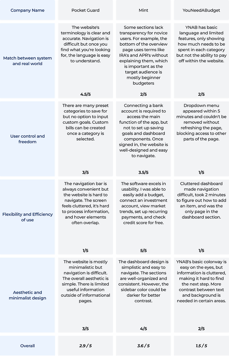
I started by researching three existing apps that target young adults and performed a heuristic analysis rating them 1-5 against four criteria, with 5 being the highest.
Match between system and real world: Does the product help the user with their most fundamental problem — budgeting in real life?
User control and freedom: Does the product enable enough flexibility for the user to feel like it’s custom-made for them?
Flexibility and efficiency of use: Does the product actively demonstrate the simplicity it desires for the user?
Aesthetic and minimalist design: Is the product designed in a way that attracts the user to engage around the product mission?
All three featured colorways that were minimalist and aesthetically uncluttered, but each struggled with usability with regard to content and signup. YNAB’s language most focused on budgeting, but it was a surprisingly lackluster and frustratingly unrefined tool for managing real-world finances. Pocketguard succeeds in simplicity but falls short in usability and freedom since it often feels cluttered and hard to navigate. Mint succeeded in creating an easy to use budgeting tool. While they fall short in some aspects of user control at signup and transparency with a beginner audience, especially when delving into deeper financial topics; they make up for it with a sleek design that is user friendly and easy to navigate.
Who is my audience?
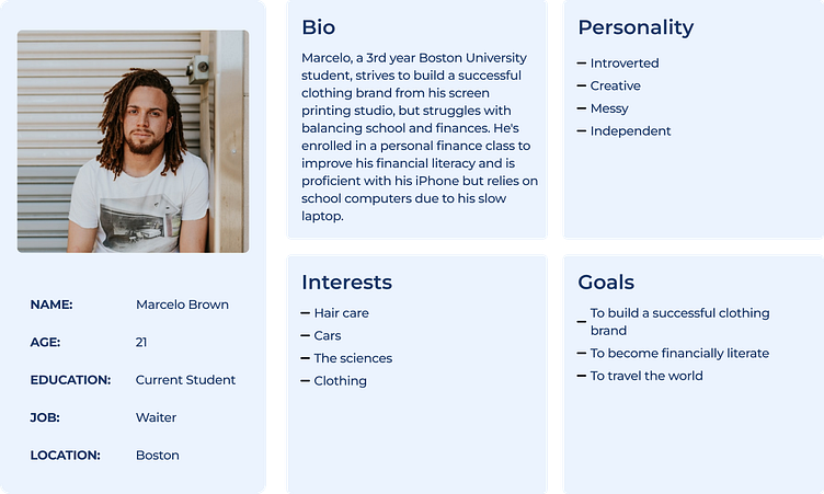
Using a combination of subject interviews and empathy mapping, I crafted the following persona.
What do users want?
When asked about potential use cases associated with their challenges, users identified the following as their top priorities:
I want to set up financial goals so I have a visual reminder of what I’m working towards.
I want to set a custom budget so I can determine exactly where my money goes.
I want to set up automatic bill pay so I never have to worry about my bills being paid on time.
I want proactive advice and recommendations on the best course of action that feels more personable rather than another tool I have to use.
I want to create and access my account from any device wherever I am.
I want to check my balances so I know how much money to allocate to different goals.
I want to be able to move my money from one place to another with ease.
I want to receive regular updates and notifications so I don’t have to remember to look up my financial information.
I want to customize my notifications so I can control what I get notified about and when.
I want to be able to contact support and receive help if anything goes wrong.
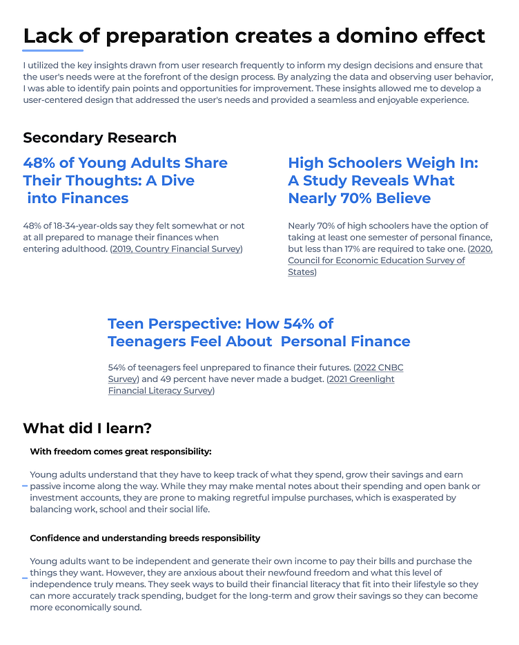
02 - Key Insights
What did I learn?
03 - Design & Development
Who or what is MIA?
Goal: To help people manage their finances with as little setbacks and effort as possible and to empower those who’ve recently been thrust into the world of adulthood or anyone who seeks to start or maintain their financial journey.
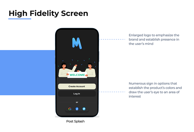
Brand Name: MIA stands for Monetary Independence Assistant. Money matters are very personal and so I also wanted the app to sound and feel like a person that the user could connect with without restraint. MIA goes beyond the confines of software and serves as a companion to the user so they don’t have to walk their financial path alone.
Brand Attributes: When thinking about user goals and adoption, I wanted the brand to feel trustworthy and secure so users feel like they are in good hands. I also wanted the brand to be personable so the user doesn’t feel as if they are interacting with a machine or a generic program but rather that they have a friend that is invested in helping them along their journey with useful tools and advice to hold themselves accountable along the way. Of course, any effective interface has to feel effortless to use. Also, a modern, visually appealing UI would provide users with a sense of comfort and awe while using the interface.
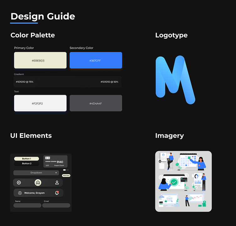
Colors, fonts and typography: Red Hat Display was chosen to convey a sense of personality as a welcoming sans-serif typeface that also scales well between titles, headers, and body text. It was adjusted to 3% spacing to improve readability and the font weight varied between bold, semi-bold, and medium respectively.
Imagery + Iconography: Images for this brand are meant to convey a sense of tranquility in what is perceived to be a stressful area of life. The users should also feel secure in trusting their finances to MIA so they continue to use it.
Overall design: A minimalist, fresh clean design intentionally simplifies the experience, removes barriers to entry and engagement, and welcomes users on a journey that gets them acclimated and using the product quickly and easily.
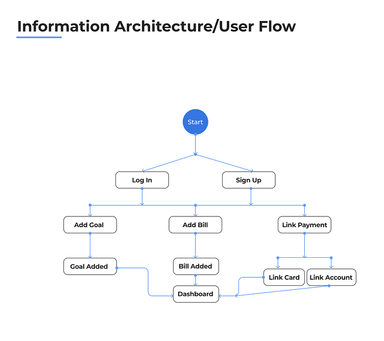
How does MIA work?
Using the user stories as a starting point, I wanted to set up an intuitive workflow that also solved for the attributes they desired most in the app. In addition to easy set up, the app needed to:
Send users motivational push notifications that encourage them to stay on track and continue their financial journey.
Provide the user with quick hits of accurate, real-time financial information so they can deepen their financial knowledge each time they engage with the app.
Include customization options, such as the color theme, so the user feels more connected to the app.
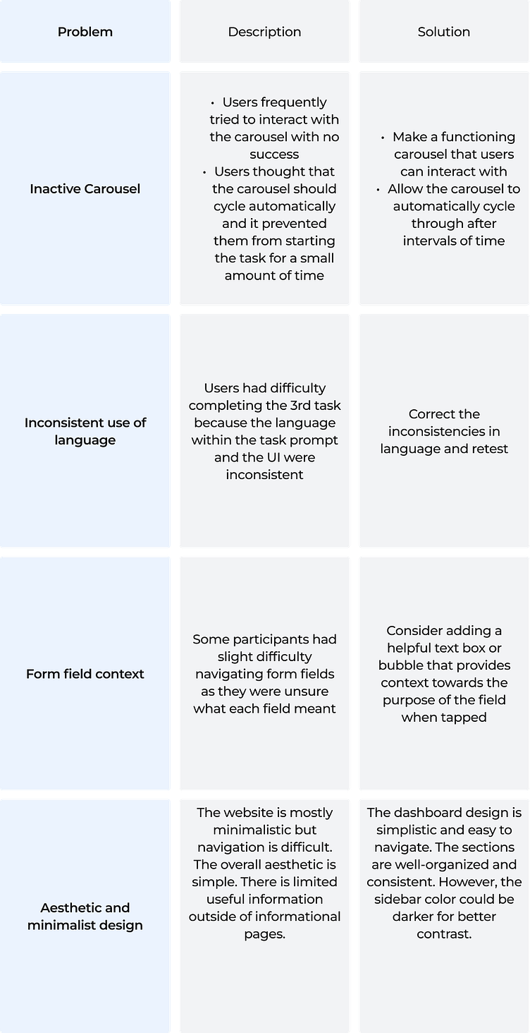
Does MIA work?
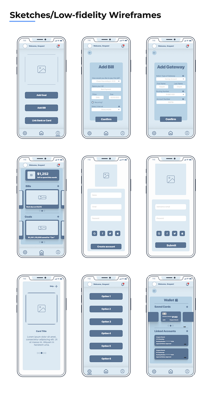
Tests were conducted with five participants between the ages of 16-29 years old. The goal was to determine product quality and seamlessness of the experience to promote adoption and repeat usage. The test objectives were to uncover usability and other technical issues within the red routes of the product. Two key questions to answer were: Is our prototype seamless and how do users navigate our product. The test tasks were as follows:
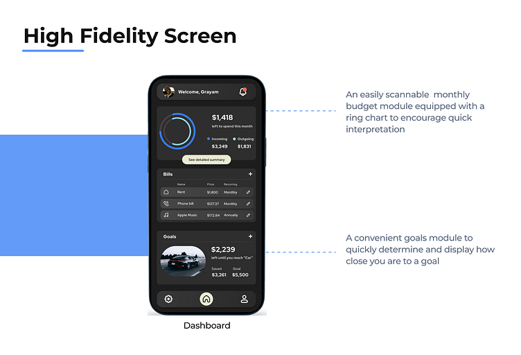
Task 1: Add a goal
Task 2: Add a bill
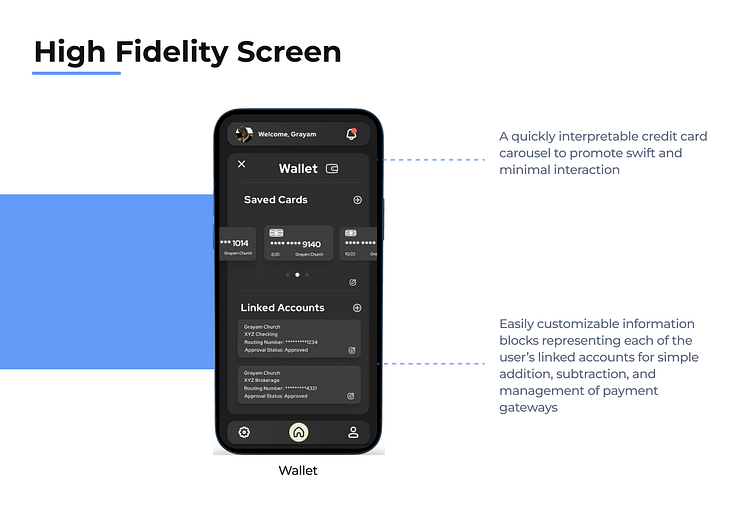
Task 3: Add a payment gateway
Task 4-5: Add a goal and bill from the dashboard
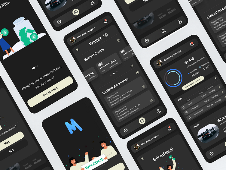
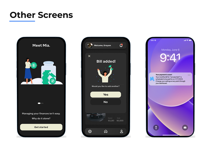
04 - The Final Product
I designed MIA to feel modern, lightweight and easy to use. Its simplicity is its central asset. It maintains a strong screen presence by guiding the users’ eyes directly to the information hotspots while simultaneously controlling the flow of information on the page. Users meet little to no resistance at every point of interaction and can learn the basics of budgeting while growing their financial acumen at a pace that relates to their specific situation.
Key Takeaways
My first UX case study on the app "MIA" taught me the importance of preparation and iteration in the design process. Through thorough planning and multiple revisions, I was able to create a minimalistic and functional app that effectively uses signifiers and allows for future improvements in the user experience. One key takeaway was the importance of collecting quantitative research in future iterations to further optimize the design. Overall, I am satisfied with the final product and am confident that it serves its purpose and provides a pleasing user experience.
Future Roadmap
Implement Quantitative Research: As mentioned in the conclusion, collecting quantitative research data is crucial for optimizing the design further. This can be achieved by conducting user testing sessions with a larger sample size and using analytics tools to track user behavior and interactions within the app. This data can be used to identify pain points and areas of improvement that were not apparent during the design process.
Address User Feedback: Feedback from users can be used to address any concerns or issues they may have with the app. Conducting surveys or feedback sessions can provide valuable insights on user preferences and expectations. This information can then be used to refine the design and improve the user experience further.
Incorporate New Features: As technology advances, it is important to stay up to date with the latest trends and innovations. Adding new features can keep the app relevant and engaging for users. However, it is important to carefully consider which features to include and how they will impact the overall user experience.
Evaluate App Performance: Regularly evaluating app performance can help identify any technical issues that may arise. This can be done by monitoring app crashes, response times, and other performance metrics. Addressing these issues promptly can help maintain user satisfaction and prevent any negative impact on the app's reputation.
Continuously Iterate: Finally, it is important to remember that the design process is never truly finished. Continuously iterating and refining the app can help keep it relevant and competitive in the market. This can be done by using feedback, conducting research, and staying up to date with the latest design trends and technologies.