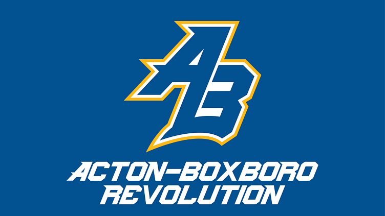
Acton Boxboro High School Athletics
Acton Boxboro Regional High School recently removed their old mascot, the Colonial, in favor of the Revolution.
In the past, athletic teams lacked brand continuity, using a wide variety of logos and shades of colors for their uniforms. The institution of the new mascot provides an opportunity for AB to press the reset button on their brand and create a new streamlined identity.
The Logo
Rough Drafts
The core of Acton Boxboro's brand is its instantly identifiable "AB" monogram. When re-designing the athletics logo, the task wasn't to reinvent the wheel. One of the first drafts took inspiration from a logo from the 1980's and played off of revolutionary-era style fonts. Seen as too "outdated," I went back to the drawing board.
Adding Motion
Inspired by how the Red Wings took their retro logo and made it new for the NHL Stadium Series, I used the core elements of the first concept and tried to make them more modern.
Going through several iterations, I played around with line weight and the inclusion/removal of stripes.
Secondary Logo
The secondary logo is a circle, making it great for patches on uniforms and social media accounts. The name "Revolution" instantly brings the Revolutionary War to mind, and design elements play off of that aesthetic.
The Branding
Balancing Elements
For the AB brand, I developed a custom font that could be used in a variety of ways. Throughout the project, I wanted to balance the two opposing elements in the name "Revolution." One side calls back to AB's colonial past. The other pushes forward to the future. While some elements like the secondary logo play off the retro feel, the wordmark focuses on the latter.
Wordmark
Based off of the primary logo, the wordmark features some serifs and is italicized to add motion.
It can be used several ways, as seen in the Style Guide further down.
Style Guide
Below is a slide show featuring the pages of what the AB Athletics style guide would look like
It includes official colors, fonts, and logo uses.


