Redesigning an Online Jewelry Store's Product & Checkout Page

Project Overview:
The online jewelry store has been selling authentic diamond and gold jewelry across ten different categories for the last ten years. The company recently made plans to increase their existing conversion rate from 3% to 4% in the next six months. As an independent UI/UX designer, my task was to redesign the product page to maximize add-to-cart conversions and increase the usability of the page.
Design Process:
Research & Analysis-
Before starting the design process, I conducted thorough research on the jewelry industry, specifically focusing on the online jewelry market. I also analyzed the company's competitors' websites to gain insights into industry trends and customer expectations. Based on my research, I identified several key factors that influence customers' purchase decisions on the product page, including:
High-quality product images
Clear product descriptions
Trust and credibility indicators
Easy-to-find information about shipping and returns
Related products suggestions
Wireframe Design:
Based on my research, I created a wireframe of the new product page. I focused on simplifying the layout to provide a clean, intuitive interface for the user. I made the product images more prominent, as they are the most important element on the product page. I also added a section for product specifications and reviews to provide customers with more detailed information about the product.
Challenge:
The existing product page lacked a clear hierarchy, with multiple calls to action and cluttered information. The challenge was to create a clean and straightforward layout that highlights the product's key features and encourages users to add the product to their cart.
Solution:
I focused on optimizing the new design for both user experience and search engine optimization.
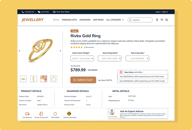
The new design features a large product image, a clear and concise product description, and a prominent add-to-cart button. To provide additional information to the user, I added a section for related products and a customer reviews section.
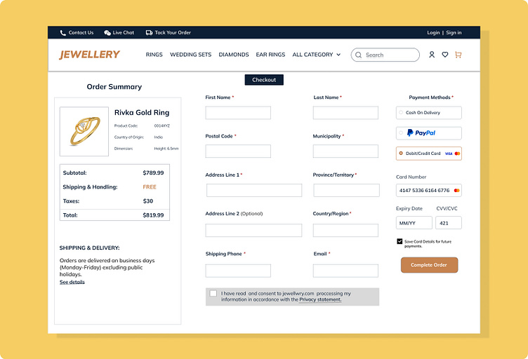
I also designed a wireframe for the checkout or payment page of the website to further improve the user experience. The wireframe includes a simple and straightforward layout that guides the user through the checkout process, making it easy to complete their purchase.
Key Features of the Redesigned Product Page:
1. Large and Clear Product Image: The product image is prominently displayed on the page and captures the user's attention, making it easy for them to see the product's details.
2. Clear and Concise Product Description: The product description provides essential details about the product in a clear and concise manner, helping the user make an informed purchase decision.
3. Prominent Add-to-Cart Button: The add-to-cart button is prominently displayed on the page, making it easy for the user to add the product to their cart.
4. Related Products Section: The related products section provides the user with additional options to explore, encouraging them to browse more products on the website.
5. Customer Reviews Section: The customer reviews section provides social proof, giving the user confidence in their purchase decision.
Results:
The simplified layout and intuitive interface provided a better user experience, resulting in an increase in the add-to-cart rate. The modern, elegant design also improved the website's overall aesthetic and conveyed a sense of trust and credibility to customers.
Future Enhancements:
In the future, the company could consider adding a "Buy Now" button to the product page for a quicker and more streamlined checkout process. Additionally, a "Related Products" section could be added to suggest complementary products to customers, increasing the chances of additional purchases.
Conclusion:
In conclusion, the redesign of the product page for the online jewelry store was a success. The new design improved the overall user experience, emphasized clear calls to action, and optimized the design for mobile devices. The addition of a related products section also enhanced the user's shopping experience and increased the likelihood of making a purchase. The new design is expected to help the client achieve their goal of increasing their conversion rate from 3% to 4% in the next 6 months.