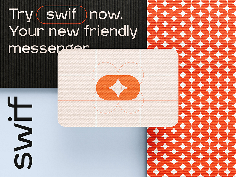
Swif - Brand's additional visual assets
Yesterday, we shared the key components of our branding project for Swif, a messenger app designed for young users. These included the logo, color scheme, and fonts.
Today, we want to showcase this brand's other essential visual elements.
Extra touch
Swif is designed for a younger and more active audience - its style and character are also young, bright and dynamic. But not shouty, more light and cheerful.
The combination of bright patterns and pastel shades balances the layout. This combination conveys the main message - simplicity and fun.
More by Outcrowd View profile
Services by Outcrowd
Like


