OBJEkT Magazine redesign
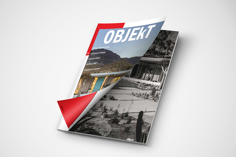
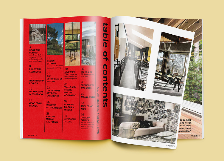
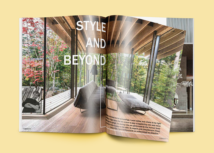
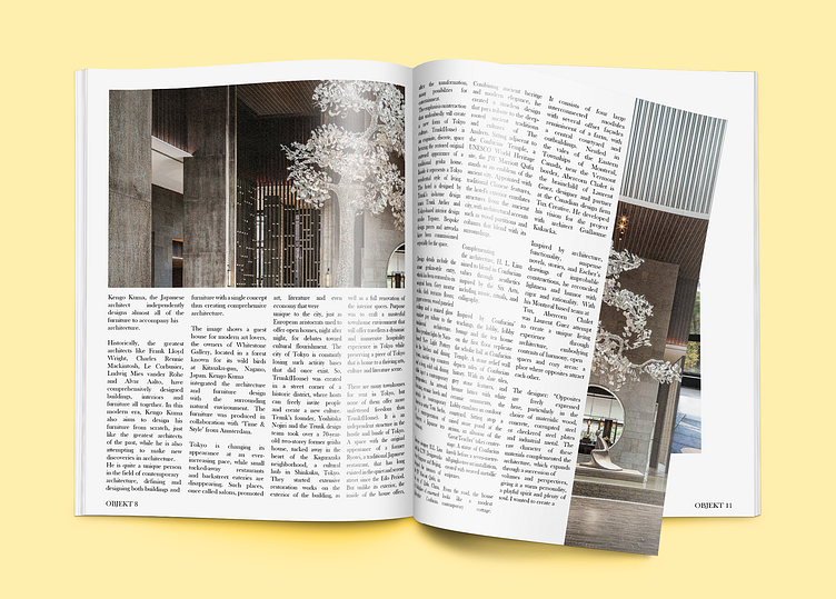
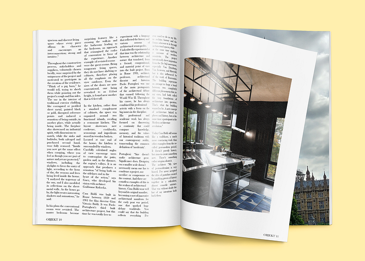
These spreads are for a redesign of a European architectural magazine, OBJEkT. By taking images from the magazine itself and using them to fill the pages, create the table of contents, and make a few spreads with body copy from the magazine articles themselves, I was able to create what looks like a new, updated version of this magazine. The harsh red of the table of contents sticks out and draws your eyes towards it, which is very crucial in a magazine. If the first few pages aren't interesting, then the whole magazine may be thrown to the side and ignored depending on what kind of person the viewer is. I always try to pull people in with my design ability.
