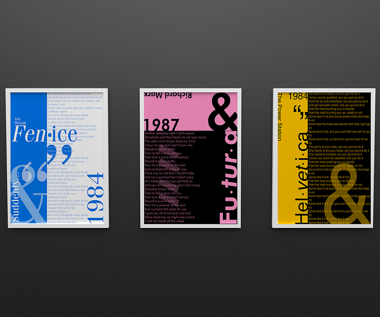
Striking Typography Posters
These prints were created as a few pieces of type exploration. I decided to explore various typefaces using colors that I associated with them, like Fenice I thought would match with a cool blue, Futura with a hot pink, and Helvetica with a golden yellow, to name a few. These posters look like they could hang in an art studio or a classroom, representing other characters including quotation marks, numbers, and ampersands, because the ampersand, as well as the quotation mark, varies with every typeface. In some, it's beautiful, while in others, it's clunky. For a fun, trendy vibe and instead of showing the alphabet as a whole, I chose to include song lyrics, the titles of the artist and albums, and the year, all beautifully littered around the pieces.
