Job search Dashboard for Retired Professionals


Task:
Exploring their website - www.wisdomcircle.com and Signing up to understand the process better.
The assignment tasks:
Analyze the Dashboard
How can the UI of the Dashboard be improved?
Redesign the existing dashboard
Optional: Any suggestions on improving the overall UI / UX beyond the dashboard.
https://www.figma.com/file/vRbEp5c4Zvm9k5vikgmuts/WisdomCircle?node-id=0%3A1&t=p75iJid5GIY8xW84-1
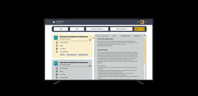
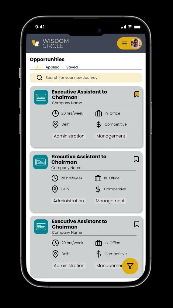
Now this is far from perfect, but here is the first draft of at least where and how I think the elements should be, of course, it needs to be worked on a lot, tons of user testing, AB testing etc. in the end would give us a far more polished result.
I made it a point to keep the font big enough to be readable, include the brand colors to highlight stuff that is important. Priority wise the information is readable at a glance too.