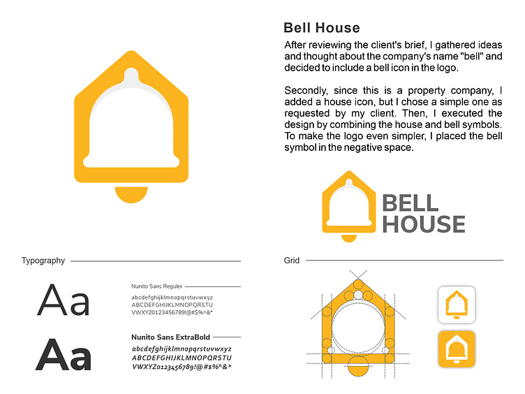
Bell House Logo
My client has a property business called "Bell House" and they want a simple and memorable logo that represents a warm and attention-grabbing house atmosphere.
After reviewing the client's brief, I gathered ideas and thought about the company's name "bell" and decided to include a bell icon in the logo.
Secondly, since this is a property company, I added a house icon, but I chose a simple one as requested by my client. Then, I executed the design by combining the house and bell symbols. To make the logo even simpler, I placed the bell symbol in the negative space.
The color I chose is yellow, as it provides warmth to the residents, and for the font, I chose a sans-serif font to give it a simple and modern look.
More by Ali Bahtiar View profile
Like
