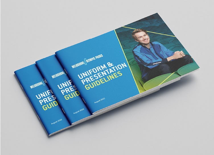
M&OP lookbook
After choosing a range of winning student uniform designs, Melbourne & Olympic Parks wanted to put together a look book detailing all of the new pieces and guidelines for staff to follow.
My design makes use of the M&OP brand colours and fonts as a base and a large triangle framing device which is a nod to the pattern in the uniform design. The finished piece is fresh and engaging.
More by Rhys Parkinson View profile
Like


