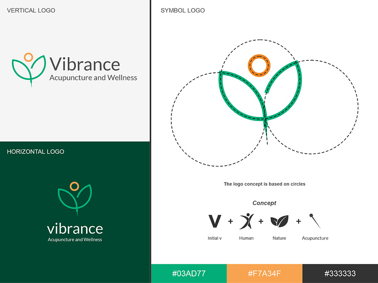
Vibrance Acupuncture and Wellness Logo
My client owns an acupuncture health clinic named Vibrance and needs a logo for it.
The clinic serves sick people by prioritizing natural and traditional treatments, especially acupuncture. They also provide herbal medicine made from natural ingredients such as leaves.
After reading the brief, I started looking for ideas and came up with four keywords:
The letter V as the initial of Vibrance.
A healthy human figure as a representation of patients who have been treated at the clinic.
Leaves as a symbol of herbal medicine from the clinic.
Acupuncture needles as the clinic's main service.
After gathering the ideas, I began executing the logo creation process and chose a lineart logo type to make it look modern. The resulting logo is as follows:
Next, I chose the color green to give a natural impression, and the color orange to provide a cheerful atmosphere for patients.
