Circle Thunder Logo
Someone needs a logo for their small-scale private hydroelectric power company called "Circle Thunder". They want a flat logo.
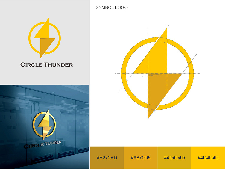
After discussing with the client, I created a logo from a circle and an electricity icon to make it easily recognizable.
The circle in the logo of a hydroelectric power company often represents a water wheel or turbine, which is the main component of hydroelectric power generation. In addition, the circle also symbolizes completeness and perfection, which can be interpreted as the company providing a continuous source of electrical energy and meeting the electricity needs of their customers.
Furthermore, the circle can also symbolize interconnectedness and sustainability. The rotating circle shows that the energy produced is constantly flowing and circulating. This portrays that the company provides a reliable and sustainable source of electrical energy in the long term.
The color yellow symbolizes the energy generated from the rotation of the water wheel.
