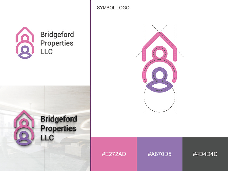
House Lineart Logo
My client ordered a logo for their new property company with a focus on being child-friendly for families with new children.
After reviewing the client's brief, I started to gather ideas. Firstly, I emphasized the concept of a child-friendly home and added an icon of a parent holding a child to represent this idea. Secondly, I added a roof symbol above the human icon to represent the property aspect of the company.
I chose a line art logo to give it a modern look and used two colors for the symbol: pink and purple. Pink represents happiness and love to make families feel content in their homes, while purple represents calmness and is applied to the child icon to show that children will feel comfortable living in those homes.
The logo design features symmetrical lines and circles.
The client is starting their property business, and they want to brand it as a child-friendly property for new families.
